Susan Keith, Juror
Juror Commendations
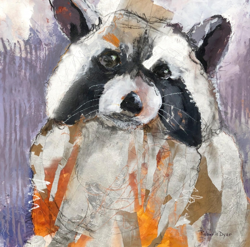
“Raider” by Roberta Dyer
You just get the character of the raccoon! I love the texture she has created with the mark-making that she has done with the crayon, and the soft colors in the background.
by Roberta Dyer
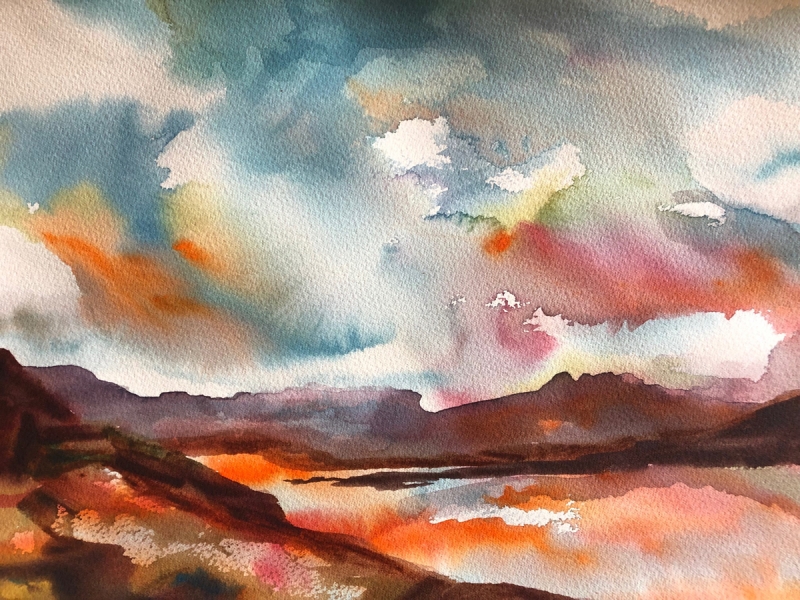
“Breezy Evening” by Nancy Phillips
I love the colors in this! The blues stand out against the oranges, and the white of the paper that is showing through is wonderful. It is a very fluid and very transparent watercolor.
by Nancy Phillips
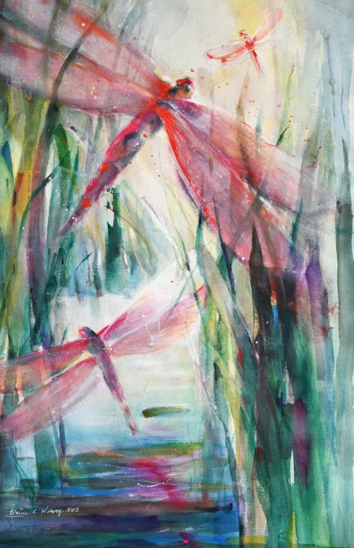
“Sparkling Reds” by Elaine Harvey
I like the reds against the green grasses, and the simplicity of the values and the shapes against one another. It has a very fresh and transparent feeling.
by Elaine Harvey
Honorable Mentions
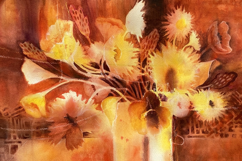
“Joy in the Journey” by Nancy Rizzardi
I like the effect of these analogous colors, the yellows and the oranges. The color palette is very simple, it is very fluid. I like the way the colors flow and blend together with the transparency of the watercolor.
by Nancy Rizzardi
“Shelter Island Fishing” by Jami Wright
When you get close to this, you can see a lot of different colors within the darker values, I like the way that they blend together, and the impressionistic value of it.
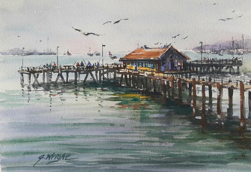
by Jami Wright
“Prado Maiden 2” by Lynnette Bredow
I like the way she used the texture of the paper to come through, and the values of the statue against the colorful tiles. I really like the use of color in this.
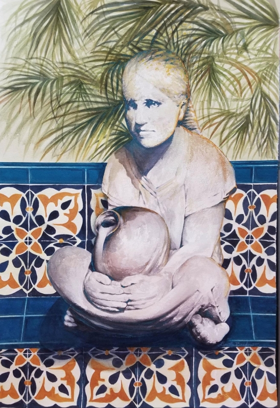
by Lynnette Bredow
Honorable Mention Miniatures
“White Rock Cove” by Jami Wright
I like the impressionistic feel of this, the simplicity of the trees, and I like the palette – it’s all cool colors, the greens and the blues.
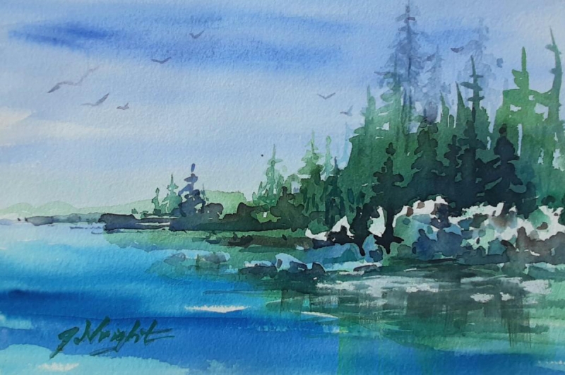
by Jami Wright
Best of Miniatures
“Vibrant Succulents” by Lori Pollack
This is really a standout in transparent water color. The highlights on this are really beautiful, how she has done them in different shades and values of pink. In contrast she has cool colors for the darker values. I love it, it is beautiful.
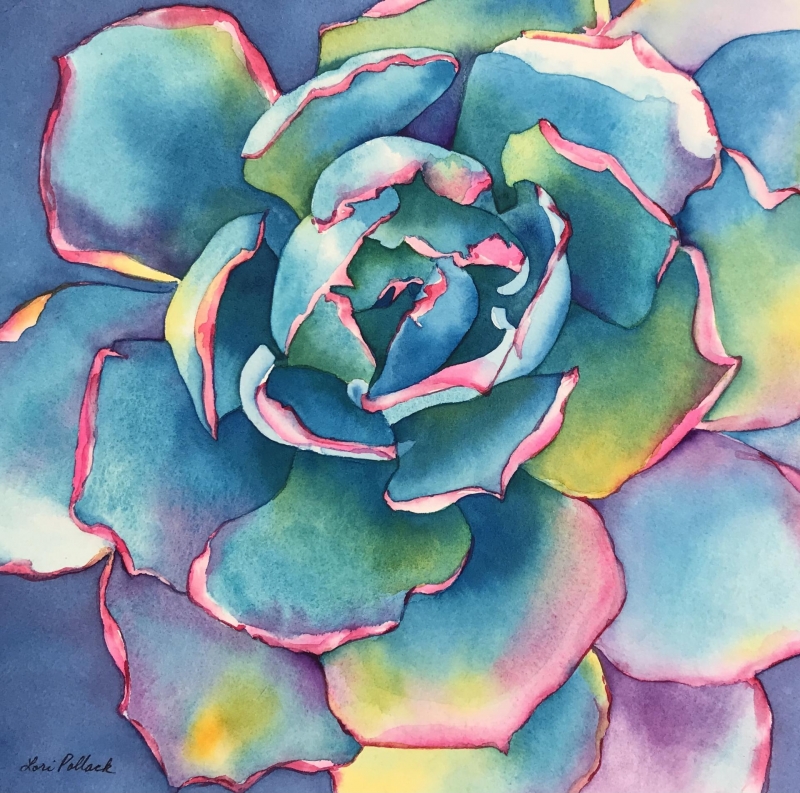
by Lori Pollack
Best of Theme
“Beach Roses” by Carol Mansfield
I think the complementary colors of the reds and the greens are beautiful. And the shapes – she has a lot of shapes in here when you get close and look at it. I was drawn to the abstraction of the roses, and the range of value with the pinks and greens.
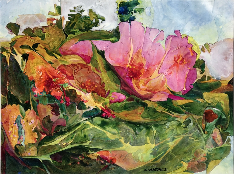
by Carol Mansfield
Third Place
“A Castle in Italy” by Gabriel Stockton
I love the color in this. You can just imagine yourself there, it has a real feel of the vibrant atmosphere of Italian architecture. The technique and the texture in the darker values are beautiful.
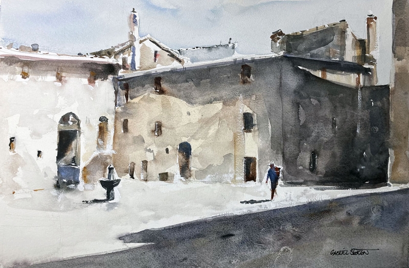
by Gabriel Stockton
Second Place
“Museum of Us” by Edward Abrams
The expertise in this is amazing, with the values and the details; I love the detail. There is so much color when you get up close to it, that it really makes the values stand out.
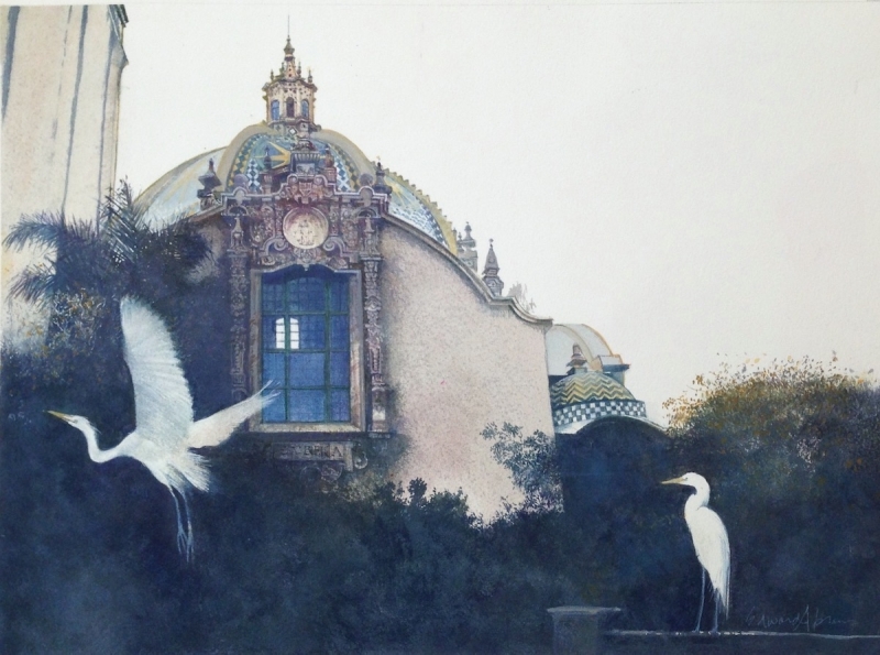
by Edward Abrams
First Place
“Pomegranates” by Peggy Weiner
I love the serenity and the vibrancy of the color. I also love the negative space, how they used the white paper, and the use of complementary colors. It is a real standout.
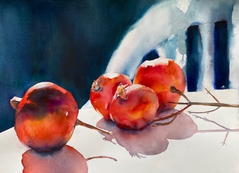
by Peggy Weiner