Juror Tiffanie Mang
Juror Commendations
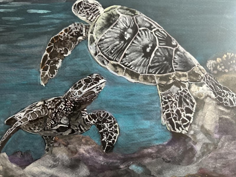
“ Turtle Cove” by Cheryl Dicus
I personally really like this one because it is simple and very effective. It caught my eye because of its boldness and almost monochromatic nature. I love the detailed way the turtles are rendered and the simplicity of the ocean in the background. It captures the mood of the deep ocean for me, and I really enjoyed it.
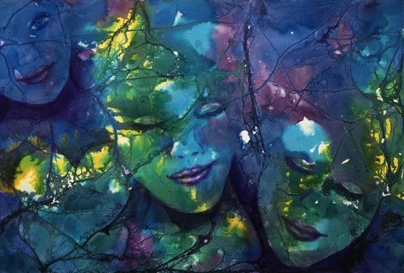
“Friends Forever V” by Astrid Edel Walter
This piece stood out to me because I liked how simple it is. But on second glance, there is a lot of play of color and textures that are very well thought out. I love the cyans and yellows, and I like how the faces are arranged on the canvas. I love the little gleams of color. It is very pleasing when I look at it.
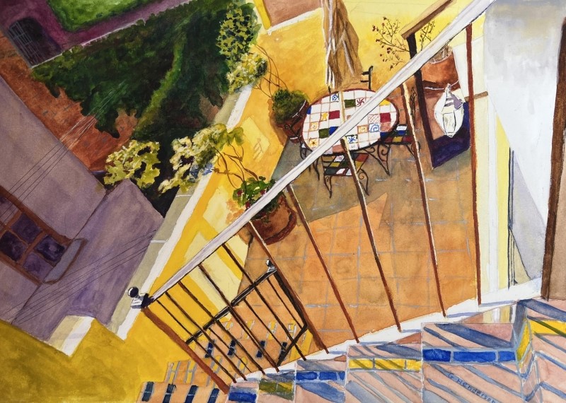
“Breakfast Al Fresco?” by Gloria Henderson
The painting captured the mood of a vibrant summer day. It is a unique composition that almost leads you down into the viewpoint of going down the stairs. I love the colors too. I thought it is a really unique piece that stood out to me.
Honorable Mentions
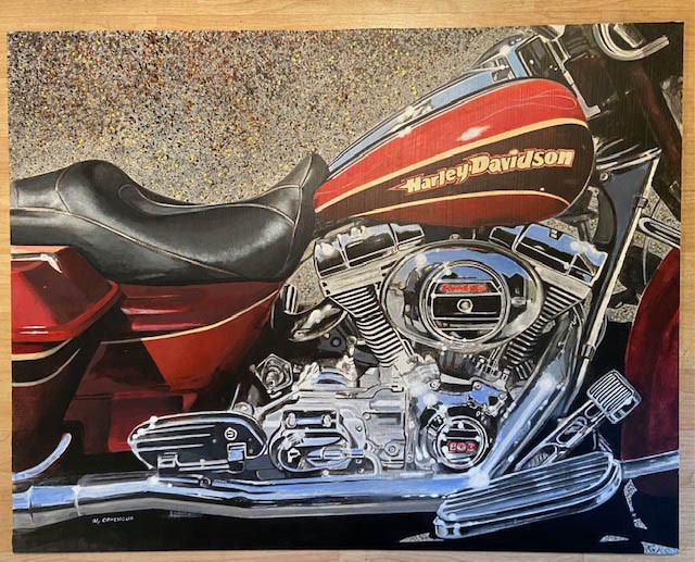
“Screaming Eagle” by Mark Cohenour
This piece stood out to me because of the beautiful rendering of the motorcycle, I haven’t seen anything like it, so great job on that. I love contrasting texture of the background with the smooth metal of the foreground. You can zoom in on it and see it like a still life and get a sense of an abstract with the shapes and textures.
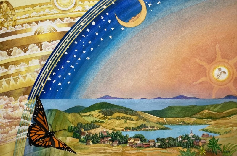
“The Mind’s Eye” Michael Garberick
This piece attracts me because it is surreal in a sense, it reminds me a little bit of Dali. It has a very clean execution. I love the way the butterfly invites you in. I love the composition as well, and I think it is especially well executed.
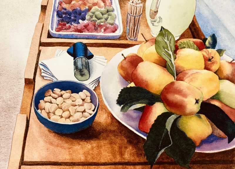
“Drink Cart” by Stephanie Van de Wetering
I love how clean this piece is. It is well organized, and has a really nice composition for a still life. The colors are really popping and vibrant, and it invites you in. It made me really happy when I looked at it.
Honorable Mention, Miniatures
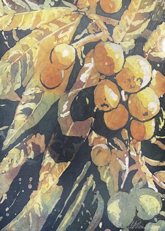
“Good and Plenty” by Cynthia Roach
I love way they use line and shape, and how they create lighting on the fruit. I love the diversion of light and dark shapes that is almost abstraction, but you still know what you are looking at. It has a good graphic sense of light and shadow. A great job with the design, a very unique painting.
Best of Miniatures
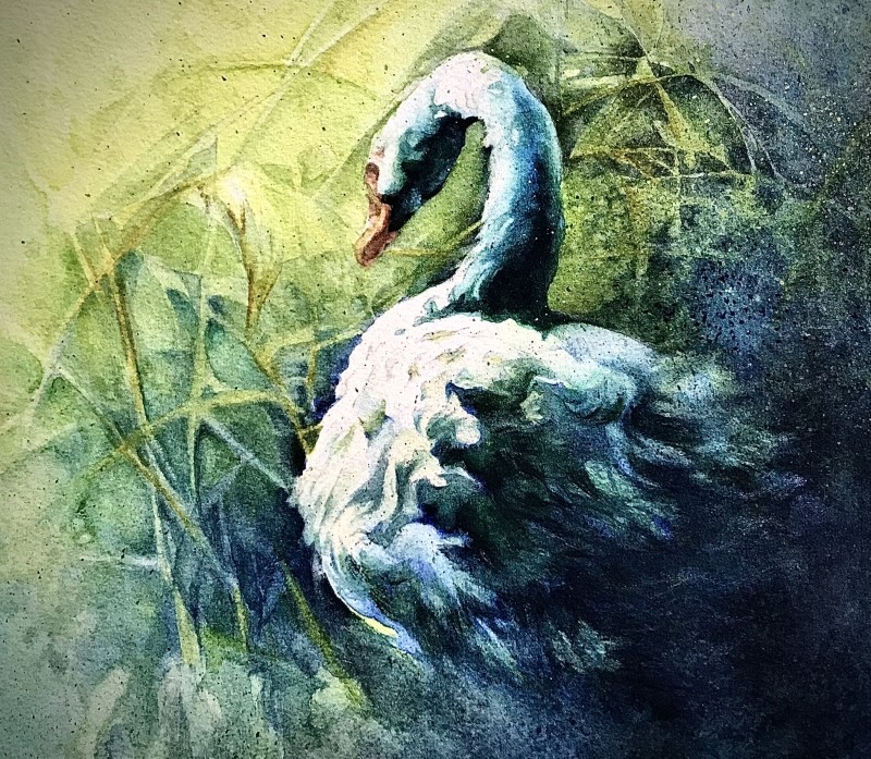
“A Calm Moment” by Ann Slater
This painting has a beautiful sense of lost edges, and clean edges. You really get the dynamic feel of the swan emerging into the light. There is a very careful handling of the foliage and the background, which is really delicate and not overbearing. I just love the simple design, and it is well executed. It is pleasing and calming to look at.
Best of Theme
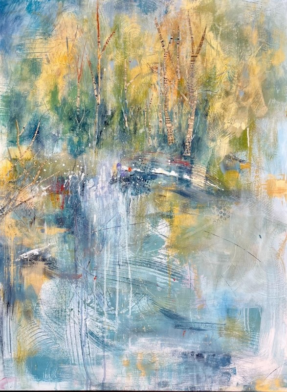
“Summer in Idaho” by Susanne Slater
I love this piece, because I feel like it is almost a soundscape on canvas. It has the different elements of texture and smoothness, the smaller notes vs the bigger notes, the masses of the trees. I still can feel the essence of the landscape, but I love how abstract it is at the same time. So, in terms of it replicating sound on canvas it was very successful. Beautiful piece!
Third Place
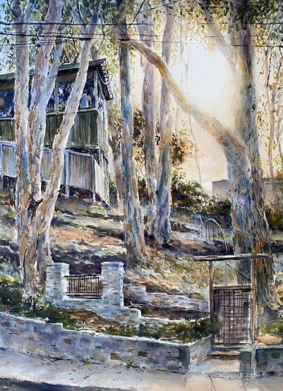
“Gage Grove” by Drew Bandish
He did a really good job rendering the feel of the light. I can sense the feeling of being in nature and of being isolated but also of being at peace. I really like the way he has created the grove light. Great job.
Second Place
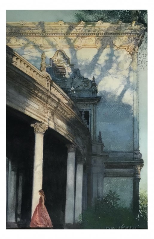
“Tree Shadows” by Edward Abrams
The painting has a rendering of tree shadows that is really beautiful, you can literally feel the mood of the shadows casting onto the building. I have never seen shadows rendered like that, and I thought it was really moving. I just love the accuracy and the attention to detail in the building, Overall, it has a calming mood when I look at it that I really enjoyed.
First Place
“The Up and Down” by Mark Smith
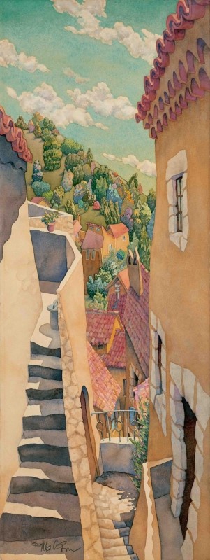
I love the painting because there is a great styling and energy going on, with the cascading rhythm of the roof top and the stairs. It has nice clean shapes, and a playful mood. I love the way it is executed.
