Nancy Oleksa, Juror
Juror Commendations
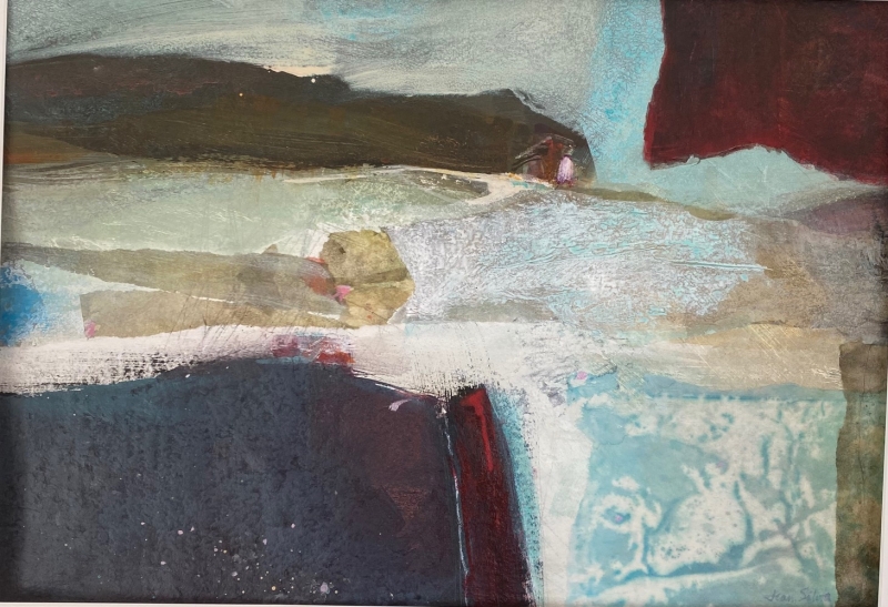
“Night Watch” by Roberta Dyer
An emotional response in “Night Watch” was created through the use of a restrained color palette and decisive brush strokes. The neutral red accents that break up the even horizontal space division, and the small white shapes that direct the viewers eye through the composition create an atmosphere of intrigue that keeps the viewer engaged.
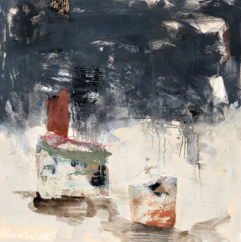
“A Few Cool Things” by Carol Dubuque
This painting is a wonderful example of alternation in color, shape and tone. Its whimsy makes it a joy to observe.
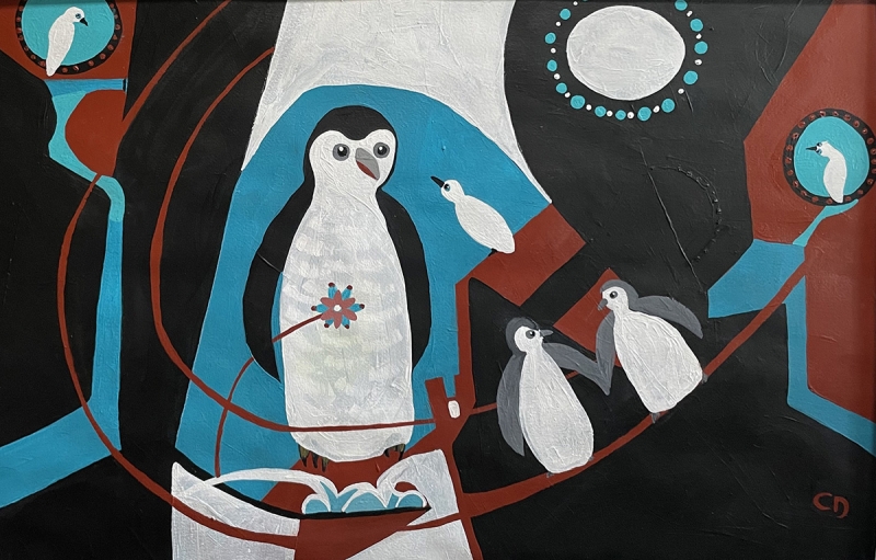
“Unraveling” by Nell Bartlett
This painting is a wonderful example of both unity and contrast. The contrasts of shape, line, tone, and texture work together with color harmony to create a visually exciting water media painting.
Honorable Mentions
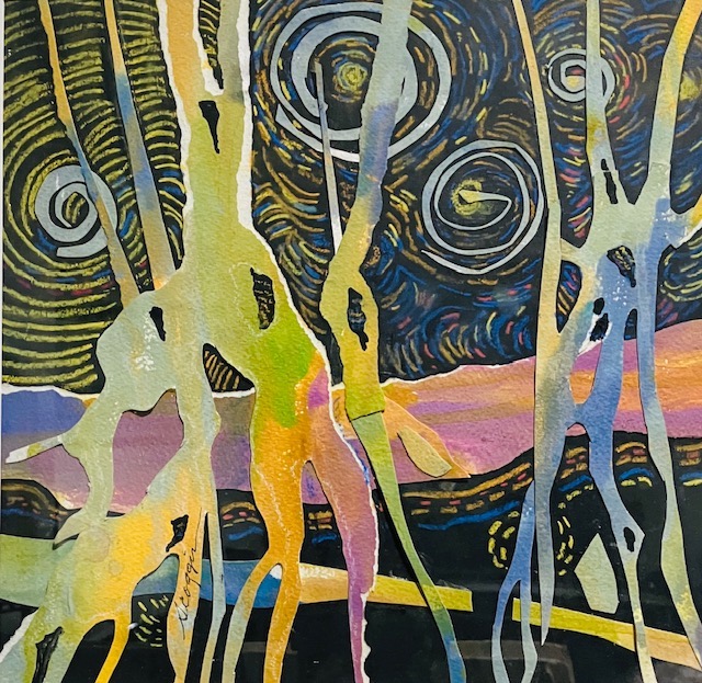
“Night Lights” by Kathleen Scoggin
The syncopation of strokes, textures, shape, color, and alternation create movement in this painting that is akin to a visual dance. It seems both exciting and alive!
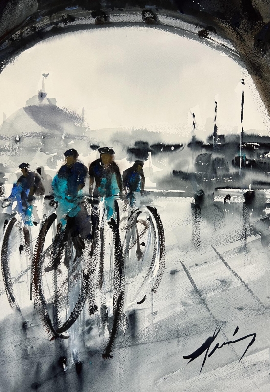
“Paris Bike Race” by Luis Juarez
The exciting use of line, expressive brush strokes, soft edges, and limited palette used in this painting work together to create a sense of atmosphere, which is the essence of a good plein air painting.
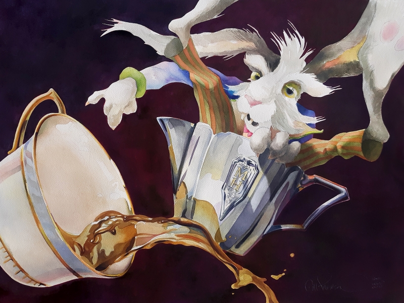
“Bad Hare Day” by Chuck McPherson
The professional application of paint and use of negative space in this painting are amazing. It’s a fun piece that will make the young and old that view it, smile.
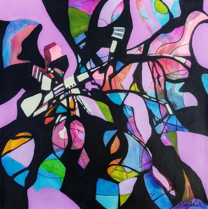
Honorable Mention, Miniatures
“Hidden Messages” by Nancy Jo Klaphaak
The creative use of negative and positive shapes in this painting is mesmerizing. One can get lost in the kaleidoscope of colorful shapes created by the black curvilinear form while searching for the hidden messages throughout.
Best of Miniatures
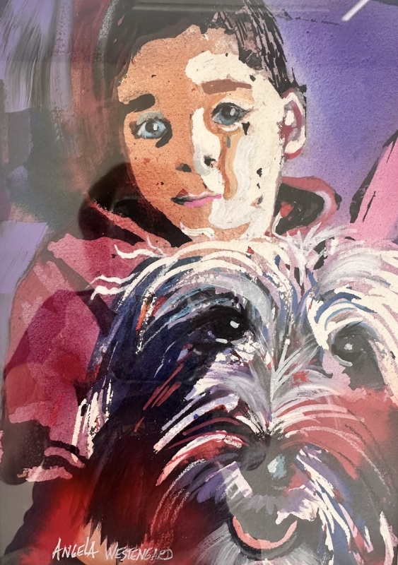
“Best Friends” by Angela Westengard
I was attracted to this painting because of its strong design and unusual choice of color. The faceted sharp edged areas contrasted against shapes of transparent, flat, colorful washes help to create a feeling of youth and contentment.
Best of Theme
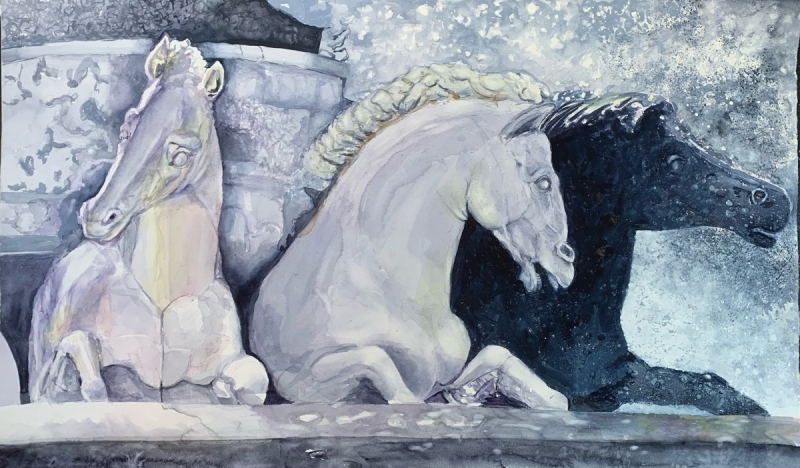
“Neptune’s Fountain” by Susan Hewitt
This painting is a celebration of the medium of watercolor. The components of the painting, its space division, use of texture, and choice of palette, have come together to evoke a sense of majesty.
Third Place
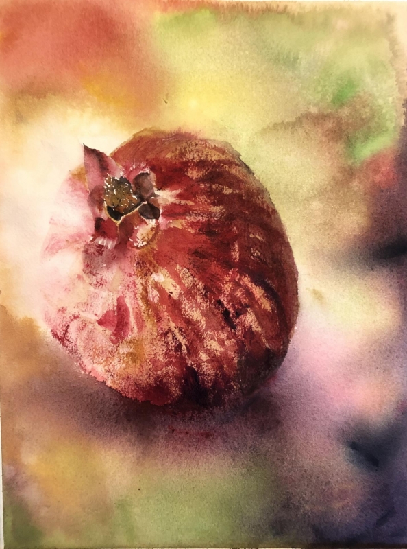
“Heavenly Fruit” by Nancy Phillips
This painting is a beautiful example of the traditional use of watercolor. It demonstrates an understanding of a variety of watercolor techniques: the application of a juicy wet into wet wash, an exciting use of dry brush, texture, color, and transparency.
Second Place
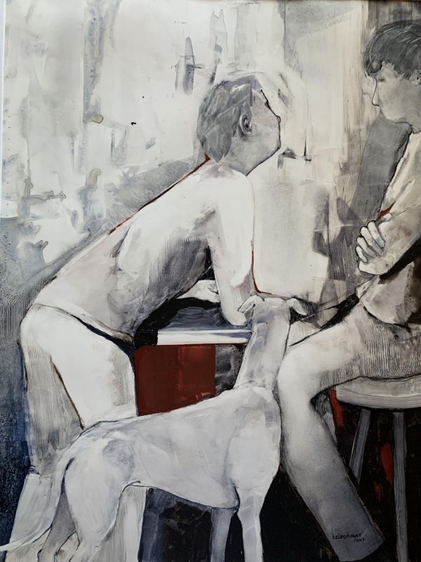
“One is Adopted” by Helen Hayes
This painting is fascinating because of the wonderful use of negative space and the cantilever placement of the figures. These elements, considered with its title and use of a limited color palette, leave us curious as their significance. It is a tour de force in subtlety and mystique.
First Place
“Ice Cold” by Jean Silva
In this painting, each shape is carefully contrasted and considered yet they work together to prove the artist has an expert understanding of the use of the principles of design and its elements.
