Juror Chuck McPherson
Juror Commendations
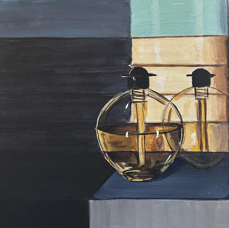
“Golden Hour” by Meghan Kharpertian
“Golden Hour” caught my attention all the way through jurying. I love the fact that it is very small, but it has a great graphic impact with the repeated circles of the bottles. I’m not sure what the bottles are: they could be perfumes, they be could something else, it doesn’t matter. The whole Deco break-up of space, style and color treatment are what kept my attention. I also like the unusual format. I encourage artists to work on other than the standard full sheet or half sheet or 24 x 36-inch canvasses. This square format is a little more difficult to work with, but I think the payoff is stronger.
“Waterfront” by Susanne Slater
“Waterfront” really grabbed me from the beginning. I like that it is on a long, horizontal canvas. Unusual formats always catch a juror’s attention, and usually will hold it, if it’s designed well. This one has an “equal” break-up of space; one thing that most people would say is that the balance being exactly the same on both sides of the painting is bad, but that is precisely what intrigued me. It is two paintings, almost a diptych, but on one surface.

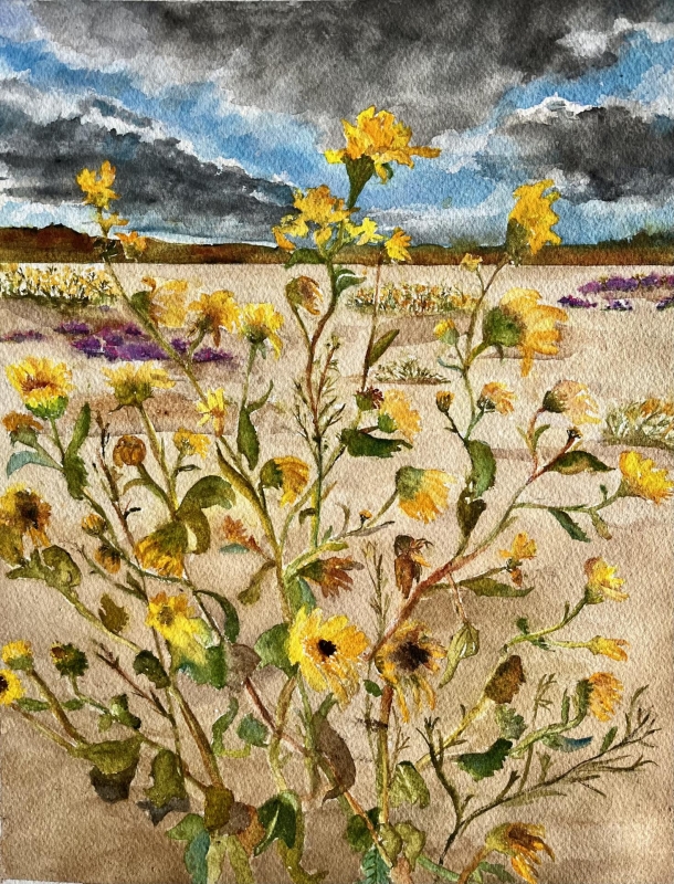
“Desert Bouquet” by Lynn Wegmann
“Desert Bouquet” was interesting. We had quite a few florals entries. Three of the other entries were very close to this composition. I chose this one because I love how the colors are much brighter than the stormy atmosphere would allow. I don’t feel any danger from it, rather protected by those very fragile little desert flowers from the approaching storm ~ it just works.
Honorable Mentions
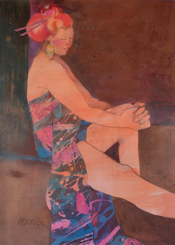
“What to Do?” by Joan Merrick
This artist always presents strength. My main focus in looking for top awards is composition and value. She really knows how to handle shapes, and “What to Do?” has a strong compositional feel. Even though she paints “pretty much the same thing all the time”, it is always surprising and fresh. A personal observation, I would love to see you offer up another of your green women; LOVE them!
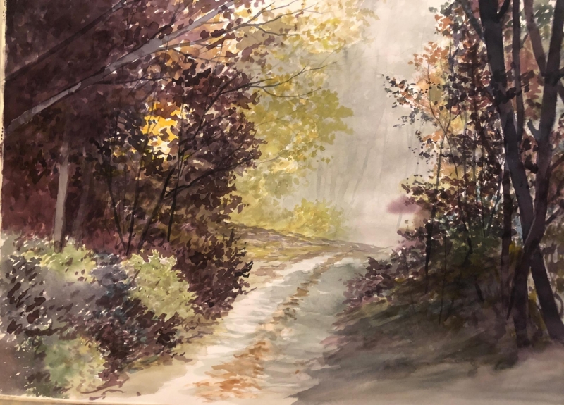
“Tranquility” by Mohammad Sadiq
“Tranquility” is a perfect title for this painting. I kept walking into it. I love the darkness that you are coming out of and heading almost towards the light. The value control is very strong, but I am glad it didn’t give me a bright spot to walk towards; the bright spot is actually in the bushes to the left. It still calls you, but you know you should stay on the path. It is very mysterious, and I like that.
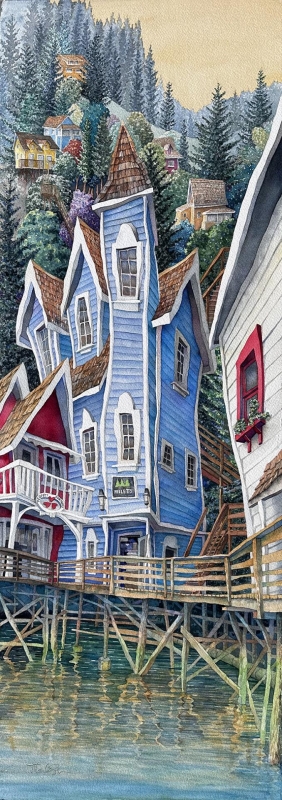
“Ketch Me If You Can” by Mark Smith
What do you say about Mark’s work? It’s astounding every time I see it. I love the fact that nothing wants to stand up, but it’s super-strong architecturally, and yet it’s got a sinuous flow that reminds me of my favorite movements of Art Nouveau, which is very much human experience oriented. And I’m guessing Mark’s had a lot of human experience.
Honorable Mention, Miniatures
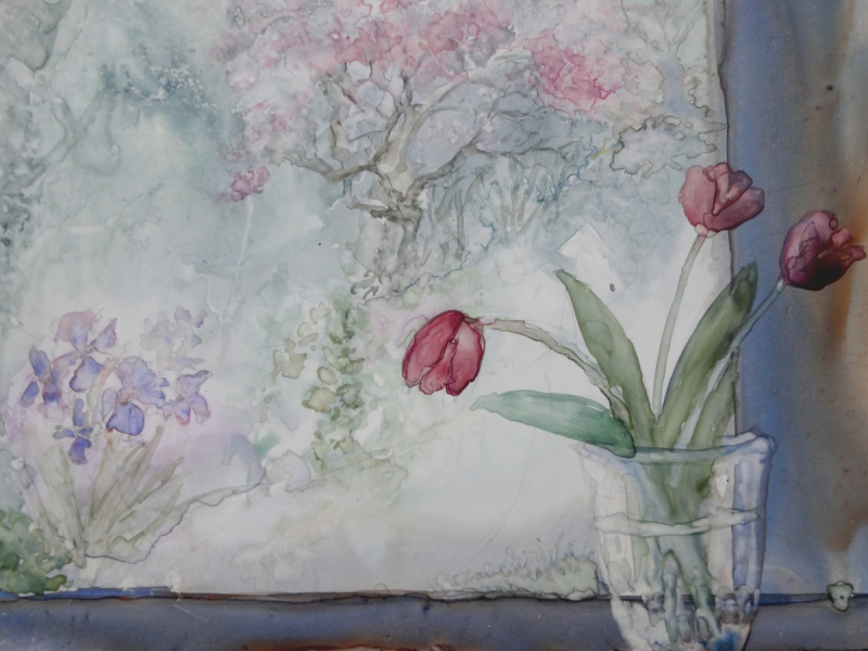
“The Secret Garden” by Susan Weinberg-Harter
Every time I see this artist’s work in a show, I am immediately drawn to and held by it, and I often return to enjoy her narrative. That’s a really good criterion for recognition. The composition and format of “The Secret Garden “ are very unusual. The way the plants interact with different sized rectangles is brilliant. The window has a high key feeling to it, and the interior features medium grays to darks. I love the atmosphere that this evokes in such a small space.
Best of Theme
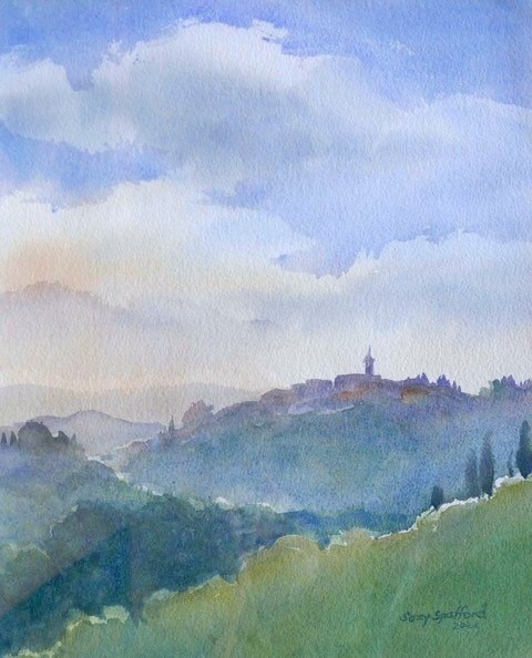
“Tuscany at Vespers” by Suzy Spafford
This piece was considered for first place, because I love that fact that it really follows the “Luminous Space” theme. I kept coming back to it, wanting to be there away from everyday doldrums. It offers the same sense of space and depth that the first place piece does, but it gave me a subject matter, a target to be somewhere, and helped me to make my decision.
Best of Miniatures
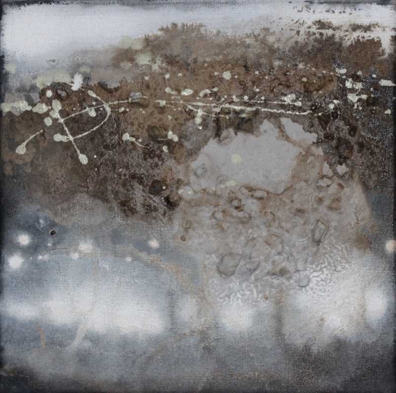
“Nature’s Spotlight” by Lucas Smith
The format is unusual, the textural surface is evocative. The value range is very strong. It has the best qualities of abstract painting. I also like the fact that it is done very loosely, like he already had somewhere else to create.
Third Place
“Selfie with Poseidon” by Stephanie Van de Wetering
I am very taken with the series that this artist is creating. It attracts my attention every time she puts something in a show. I love her interiors but are quickly being complemented by her exteriors. The fact that she captures real life in such a short moment from a subject matter that that is instantaneous is simply remarkable. I l admire how quickly she’s painting: almost a painting a day!

Second Place
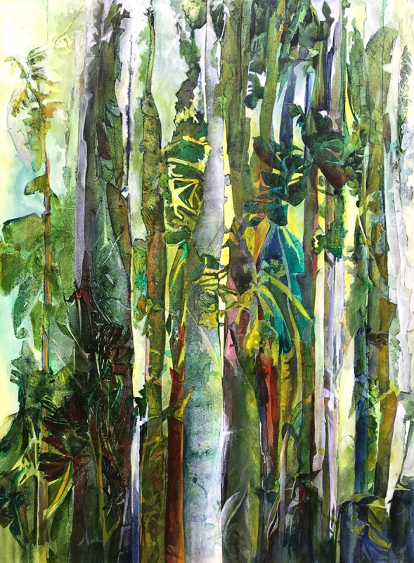
“Forest Poetry” by Carol Mansfield
I love the balance this piece has with the painting in first place, because it tells you that you are going into a forest, and that you’d better be cautious of how close you walk to the plants. There is a sense of danger that it invites ~ not a bad danger ~ just a verdant danger.
First Place
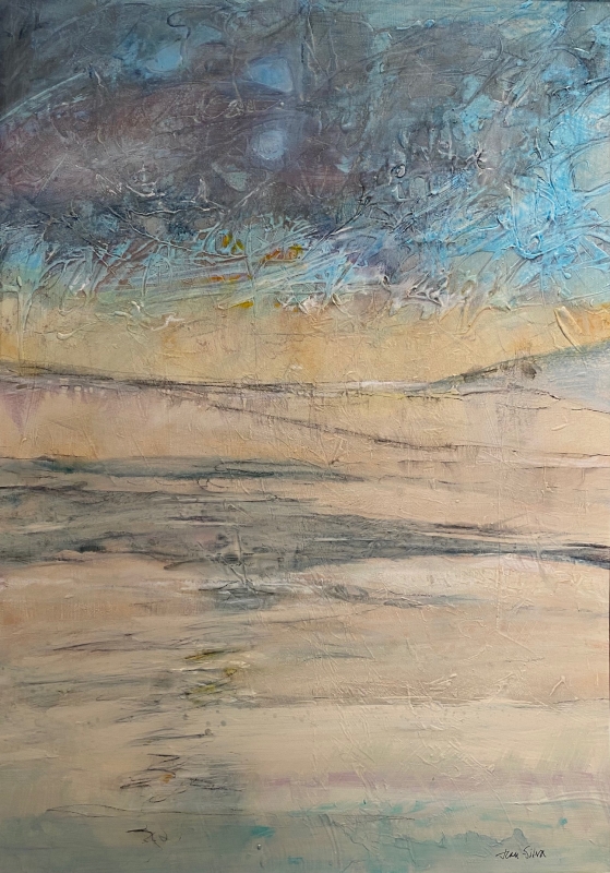
“Ice Cold II” by Jean Silva
I really like this artist’s work, and always have, because there is no deliberate statement: not a scene or a subject or anything like that. It gives you the freedom to just step into it and be nowhere… and enjoy it.
