Juror Mark Smith
.
Juror Commendations
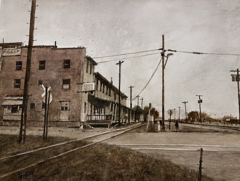
“Memory of ‘White Swan'” by Stan Goudey
Nobody understands value better than Stan. This painting is practically monochromatic and displays a great understanding of composition that makes it very exciting for a piece of architecture. I love the railroad sign set off by the dark building. Great verticals and diagonals, both of which really draw you right into the composition. He is a master.
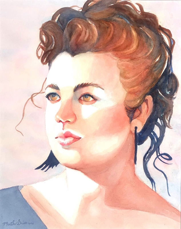
“Portrait of a Young Lady” by Martha Grim
What a beautiful portrait! The range of lights and darks is pushed, so that there is a minimal use of darks that makes it pretty and soft, a fleshy portrait. The complementary blues and oranges work well. Nice deep eyes that you can get lost in. Overall, it is the values and the complementary colors that make this portrait sing.
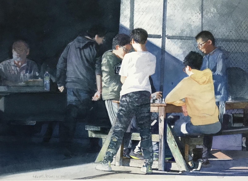
“Checkmate” by Edward Abrams
The value contrasts really make this composition sing. It has just hints of light on the dark side. There are a half-dozen figures that show an excellent understanding of light and anatomy. The light casting, the very subtle ranges of color, the value plays, and the understanding of anatomy all make this a very beautiful painting.
Honorable Mentions
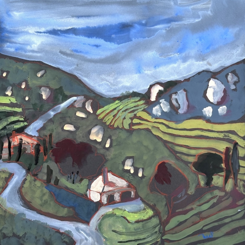
“Vineyards and Boulders” by Sarah Sullivan
I love the softness of this painting. It has a great range of values. Wonderful use of subtle complementary colors, all well mixed, not out of the tube. The masterful linework really brings life into this painting which is done mostly in mid-tones. Orange lines really make it pop. A beautiful rolling landscape. I want to go there!
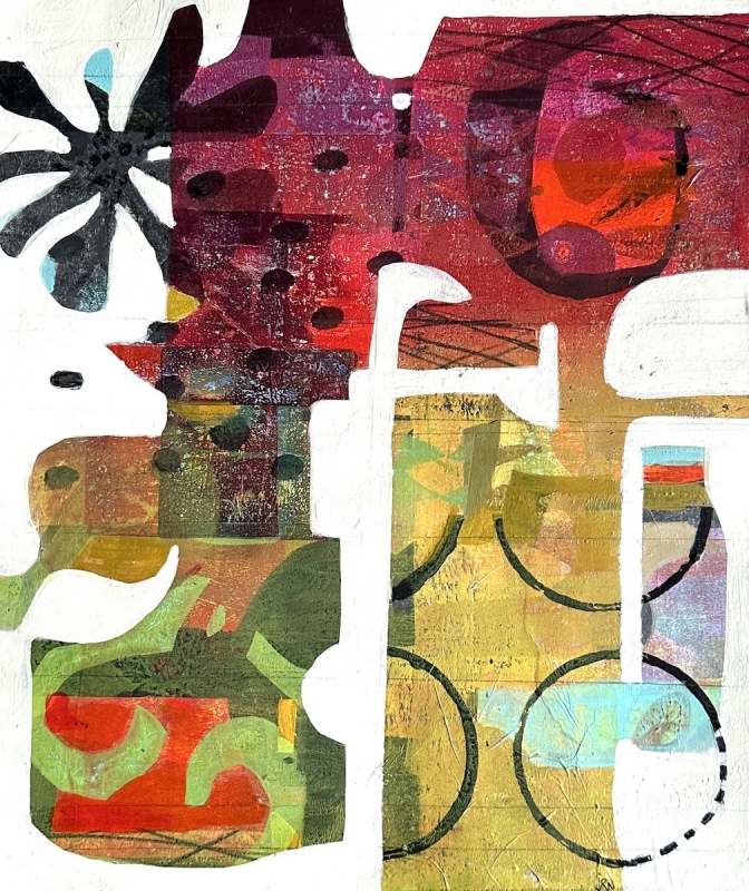
“Malarkey” by Joanne Newman
There are beautiful negative shapes here, and the underpainting has tropical and colorful red/green variations. The splatter and little bits of blue coming back through work well. The shapes are tropical and interesting. The artist knows what to cover and what to let shine through.
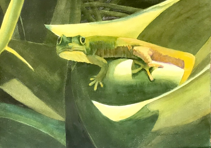
“Hawaiian Lizard” by Charlotte Kingston
Highlighting the use of a minimal palette, this is a beautiful painting. Three quarters of it is dark, leaving the lights as a minimal area that really sings. It is an exquisite tropical painting that I’d be glad to hang in my house.
Honorable Mention, Miniatures
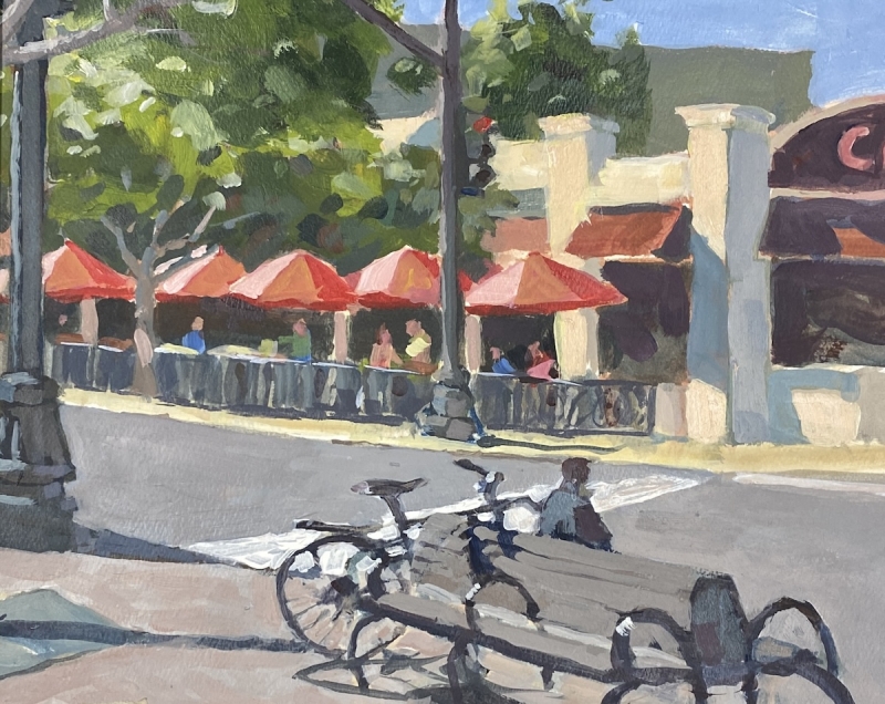
“El Cajon Cafe” by Thomas Franco
This painting has a nice composition and is well executed in an opaque medium. It has a good sense of drawing, great color, and a nice palette. Good use of complementary colors. It’s got it all. The result is a really nice street scene.
Best of Miniatures
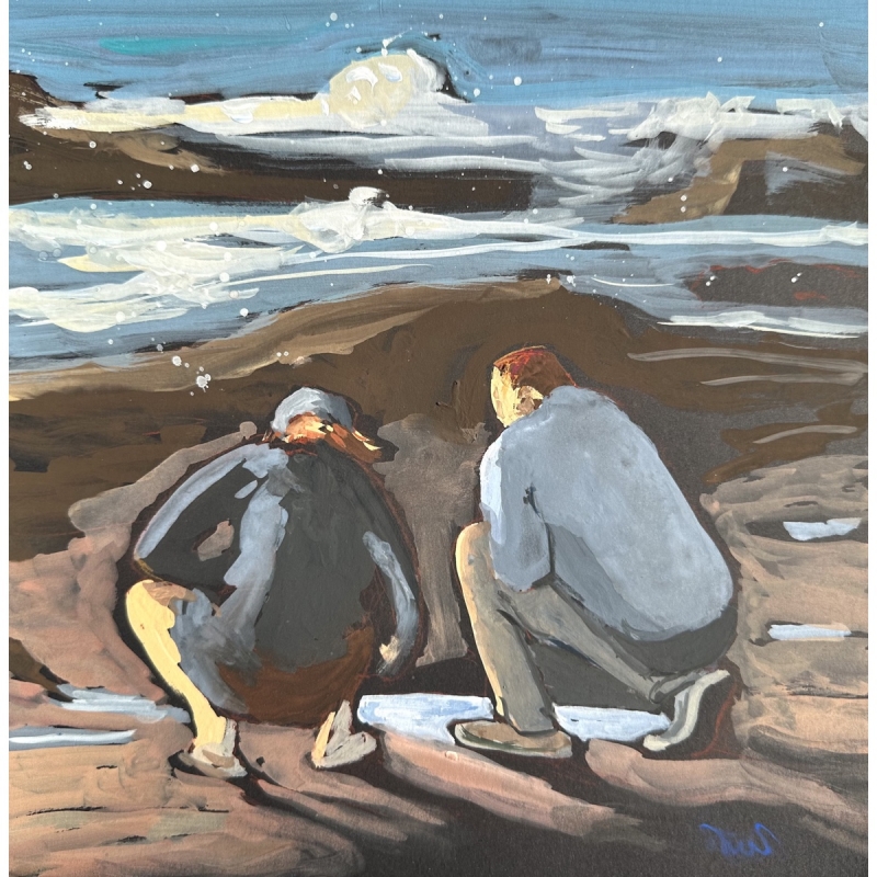
“Together in the Tidepools” by Sarah Sullivan
The technique with the opaque paint is beautiful, and it features great contrasts with the darks and the lights for value, and the cools and the warms for feeling. It is very well executed and has a nice composition. Beautiful painting!
Best of Theme
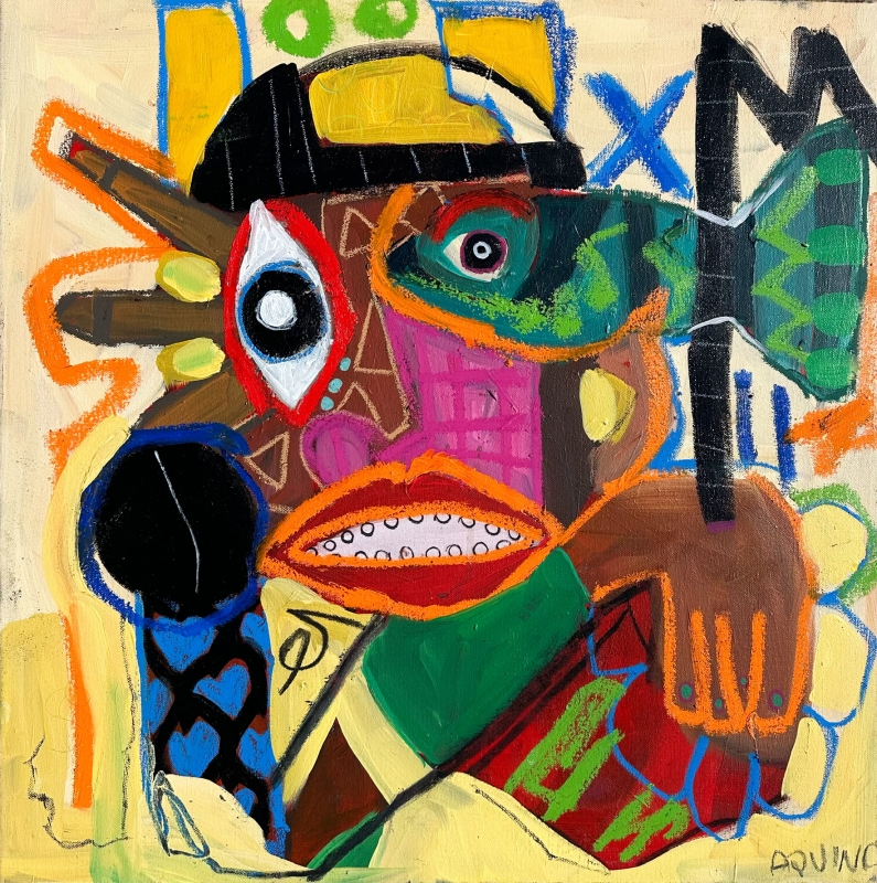
“Fisheye” by Caroline De Aquino
This nailed the theme. It is over the top with color saturation, balanced with the addition of some well-placed neutrals to keep it in control. It has a very nice use of complementary colors, shown in the orange and the blue accents and linework. The subject matter is very imaginative. The painting is playful and happy.
Third Place
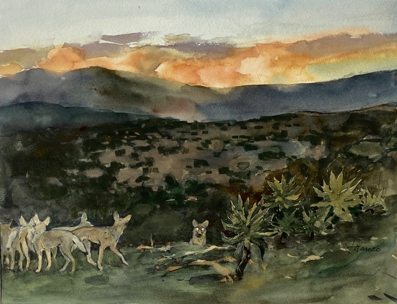
“Nighttime Harvesters” by Thomas Franco
Great subject matter! The placement of the values ranging from light to dark is very interesting. The light is on top, with the addition of a tiny bit to focus on in the coyote’s eyes below. I love the opaque mid-range tones in the middle. Exquisite handling of warm and cool: beautiful cool shadows, beautiful warm lights.
Second Place
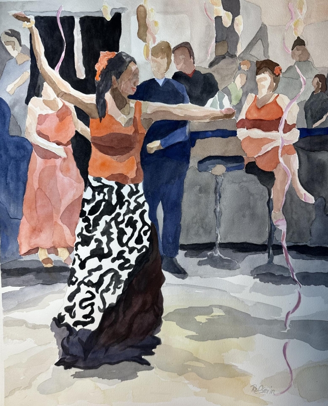
“Flamenco Fiesta 2” by Roz Oserin
There is an active line that keeps the eye moving all around the image. I love the color choices, with the beautiful corals and sweet little green accents. The painting has a full value range, too. The spots of color and value are great, and they are exactly where they need to be. I like the simplification of the anatomy, the interesting mid-tones, and the playful shadows.
First Place
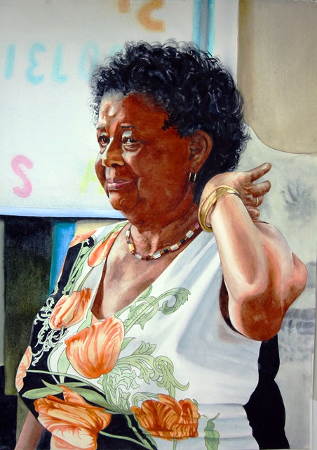
“Dancer at the Senior Center” by Robin Erickson
This artist just nailed it with the complete range of values, and the full range of hard and soft edges. It has a nice variety of colors, and a great composition. The handling of fabric and skin details is especially good. The textures of soft folds or hard and shiny are illustrated with talent and feeling. A rich portrait.
