“Engaging Shapes”
Juror Daniel Foster
.
Juror Commendations
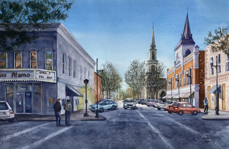
“Crossing Newman Square” by Carolina Dealy
This is a superb cityscape painting from a technical expertise point-of-view. The artist’s wonderful eye for detail is consistent throughout the painting, from foreground to the most distant background. The background does not get lost or blurred away. Many painters get “lazy” and inconsistent about dealing with the background or negative spaces within an artwork…often dealing well with the foreground and central subject(s), and then they speedily race through the background. This is an artist who goes deep and retains focus all the way in. The scene takes me to this location, it makes me feel that I am standing in the middle of this intersection somewhere in small town America.
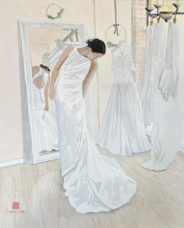
“Reflection” by Chrysanne Lowe
This is a study in shades of white, and light brown, and the subtleties that are necessary to create definition, shape and form in the painting. I get lost in the subtlety of the lines and the shapes of white and light brown that give just the right amount of contrast. I also like the personal, emotional, and cultural sensibility of it…the wedding dress, the sense of that time and place being captured by a talented artist’s interpretation. There is a story in here that I want to decode for myself, and it is easy to get transported into the subject’s moment in time and what that emotes. Finally, this painting is very different from anything else in the entire exhibition and that says a lot right there about why it stood out for me.
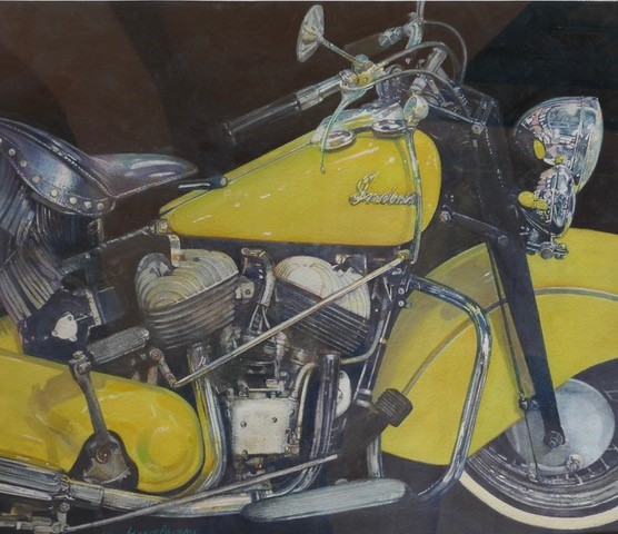
“Yellow Indian” by Edward Abrams
This is a technically excellent work. It requires an enormous technical proficiency to accomplish, particularly in the reflective imagery within the chrome features of the motorcycle. I love those small areas inside the chrome reflections that are extremely abstract and beautiful. The work tends towards super photorealistic, which risks the viewer’s experience becoming too prescribed and emotionless. This work succeeds because of its composition and dynamic lines/perspective, and contrast between dark and light, and the sublime abstract places that you can get lost in.
Honorable Mentions
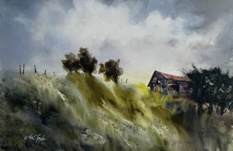
“Cloud Wall” by Lorri Lynch
This painting produces an immediate instinctual and emotional response for me. It transports me into the middle of a blustery, windy storm-filled day. It captures the “feeling” of that sensibility, not just the visual scene. The way that the foreground wind whips up into the trees and the sky creates a great sense of movement and of a stormy day. It is a simple watercolor landscape, really, compositionally straight-forward. The scene itself is not overwhelmed with technical detail that can take the life out of a scene. Sometimes the “gesture” is more powerful than precise visual accuracy produced by great photo-realistic expertise.
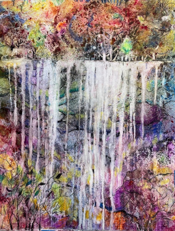
“Cascade” by Mary Compton
A very powerful painting as soon as I saw it. It raises immediate questions of how the cascade was executed so deftly within the scene. The painting conjures a strong abstract color field sensibility without losing or negating the scene. This work brings two worlds together—abstraction and landscape—and successfully finds the right balance. Both worlds exist with confidence in themselves and without conflict with the other. The cascading water imagery is outstanding technically in its subtly and is very important to the painting’s overall success.
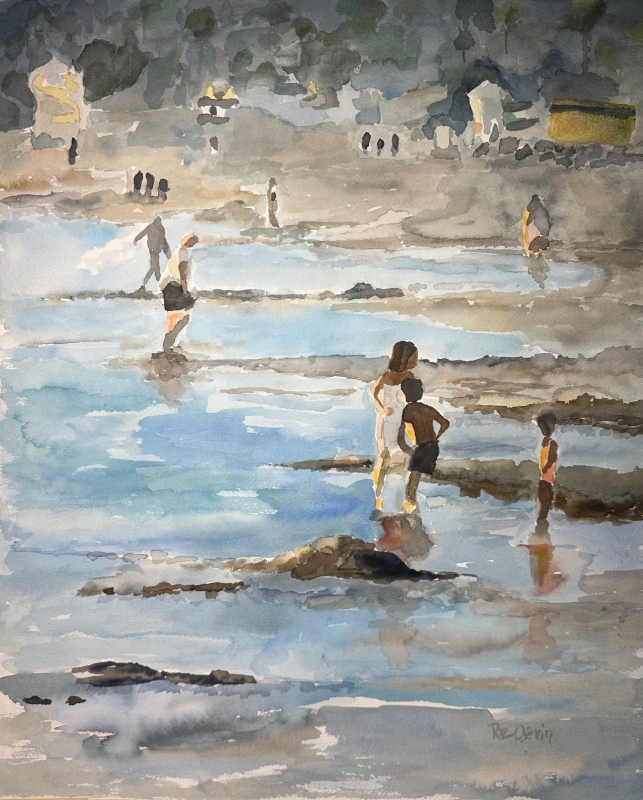
“Wading at Ocean Beach” by Roz Oserin
The use of the gesture is magnificent. It is not about the focal points or the definition, or the clarity of the landscape or the imagery and figurative. It’s all about the gesture of imagery and the sense of the artist having complete confidence in the gesture working in balance throughout the work. There is a lot of depth and layers, and it maintains the right balance of gesture in each of those layers of depth of field in the work. Also, the palette is very subtle, with nice ranges of brown and blue and green that blends soothingly. Also, it is very nicely framed to highlight the painting’s soft tonal quality.
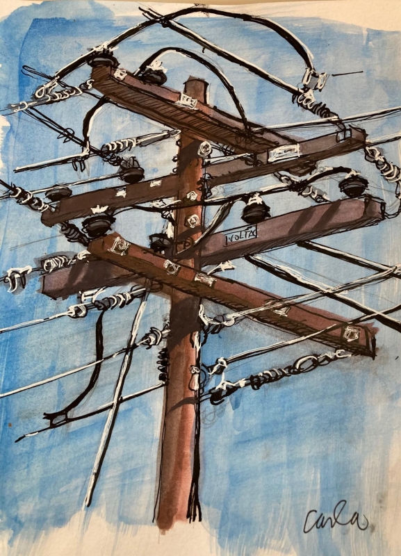
Honorable Mention, Miniatures
“Power Lines” by Carla Fox
This work has a lot of personality, despite its simplicity or mundaneness of subject. I love the dynamic stimulation of intersections of lines from many directions that creates tension and contrast against a blue sky without being overly labored.
Best of Miniatures
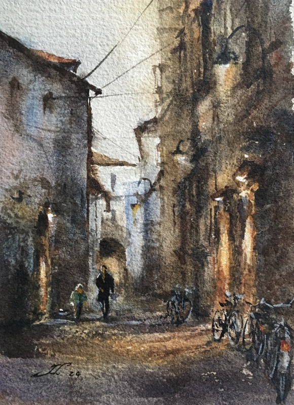
“Verona Back Alley #2” by Fan Li
Despite its very small size, the perspective and detail and proportions are fabulous. It is very atmospheric in capturing the sensibility of the Italian alley site. I love the 2 figures walking, with the bicycles in perfect proportion and balanced with the composition. I admire artists that have control over the technical approach in such a small space. It is extremely hard to do accurately and well. That is why this work stands out so spectacularly.
Best of Theme
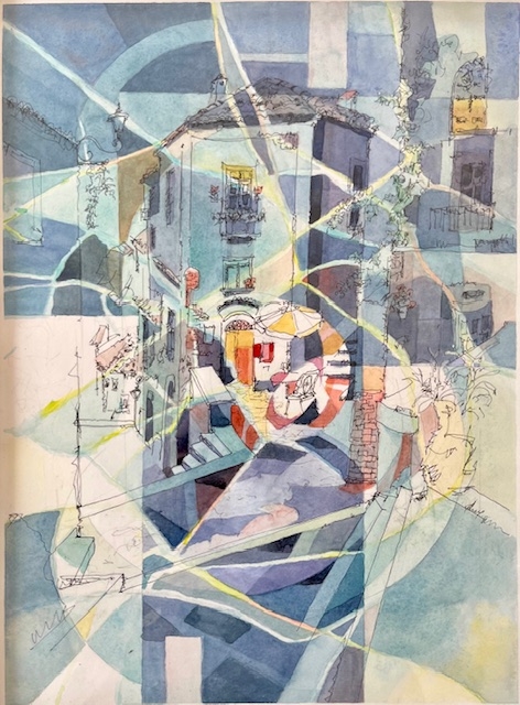
“Blue” by Elena Sacal
I love the 2 works submitted by this artist, and I had a hard time choosing which one to accept. I chose this one because it is a little more artistically formal and it accomplishes something that I value exceedingly highly which is walking the line between representational and abstraction and finding that balance where both are operating simultaneously and where the viewer has to work at navigating a full experience of the artwork, as intended by the artist. Within a relatively small painting size, there is great dynamic movement of the eye within a really distorted sense of perspective which is one of its strengths. The usage of ink assists with producing representational clarity, without losing the sublime beauty of the abstraction shapes and colors throughout – one of the reasons I choose this artwork as Best of Theme: “Engaging Shapes”.
Third Place
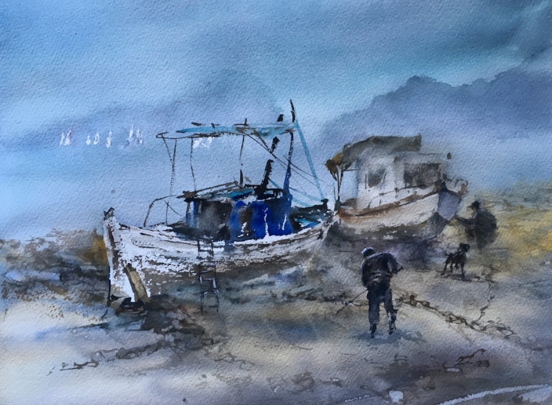
“Chaining Blues” by Fan Li
This is an ethereal landscape with very simple objects in the middle with the two boats and the dog and the 2 individuals working near them. It is simple, it is sweet, it is deft. Its blurriness creates the ethereal reality that is sublime and fabulous and different from most watercolor washes in how the subject matter emerges from watercolor wash of paint. Lots of times in watercolor paintings, the distinction between subject and wash is too uneven, but here it almost feels like these two boats naturally sink into that ethereal place beautifully. The proportions are fabulous, which is one of the things that make it so spectacular. Also, the colors are spectacular, everything is in balance and proportional in the composition. It gets better the longer you look at it, which is important for a relatively simple painting from its initial read.
Second Place
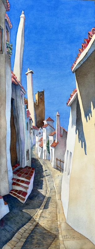
“SLIMTOWN” by Mark Smith
This is a very wonderful eye-popping “want- to – walk – into – the -scene – and – be – there” kind of artwork. I love the crispness of the buildings and the sky and the way everything contrasts with each other beautifully with the simple warm tones. Good tonal differences between the brown formal palette against this blue sky. I absolutely love the unevenness of the lines and this kind of loose informal distorted sense of perspective—it’s very unusual, unique, and compelling. I love the verticality of it, deviating from typical/common sizes of paintings. It also is wonderfully framed and presented in a manner that is really well thought-out and executed. The image floating in the frame is wonderful, and the unevenness line of the paper edge lends itself nicely to the lines in the image itself.
First Place
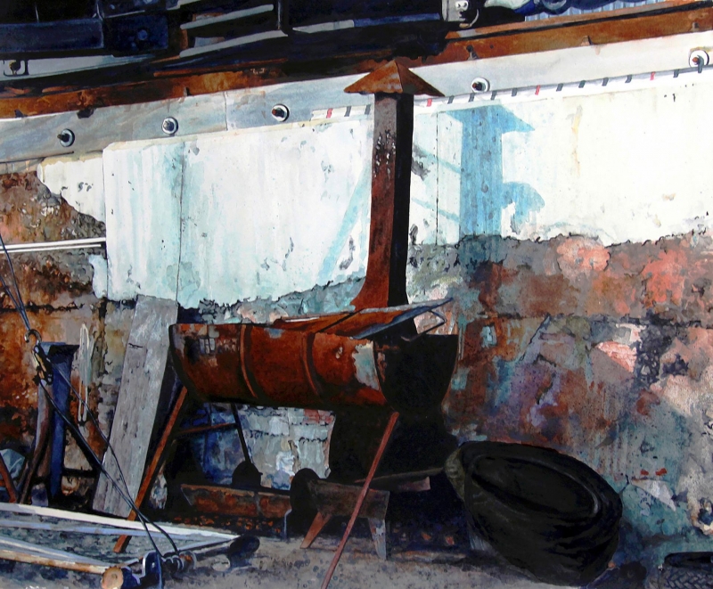
“Aeroskobing Shipyard” by Robin Erickson
It is a powerful piece that owns the room when you see it. It’s an innocuous scrapyard, resting junk, that nonetheless has been created with great weight, color sensibility, texture, and depth, I love the shadow play, the mutedness of it. The central BBQ with hood is a great central feature: powerful and balanced with everything that plays nicely off it. It is an atypical perspective in terms of symmetry. I really like the size/scale of the painting which reveals that artist’s confidence and ambitiousness with their art practice. My eye keeps moving around in it and finding nice places to land, and there are enough places in the work to keep it stimulating and not becoming stale.
