Juror: Shuang Li
.
First Place
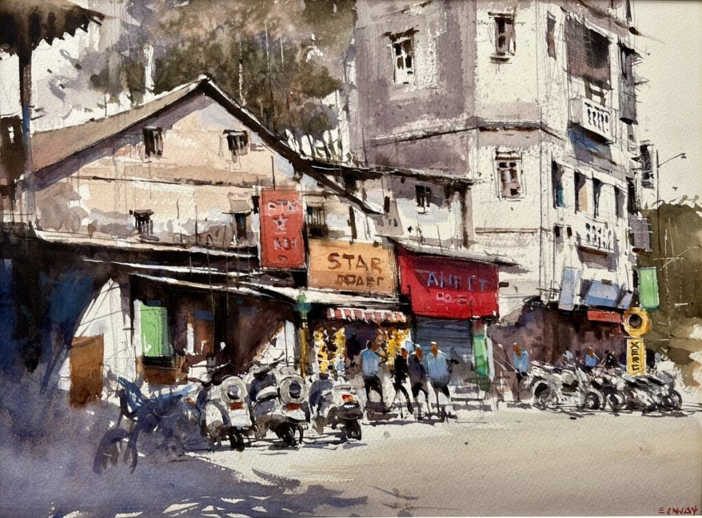
“Indian Summer” by Sanjay Desai
I really feel that it has a very strong design, and it is as freshly painted as a plein air should be. Every detail that is needed is there. I bet on that street there’s a lot of junk or many, many more people but this captured the essence of that busy corner, but not overcrowded at all. Technically, it is very fresh and with no muddy area or overworking of any kind. Besides that, in plein air you want the spirit, the lively spirit. From the motorcycles to the people that are talking, it is very well done. They picked all the needed details. Beautifully done. That is the reason it got first place.
Second Place
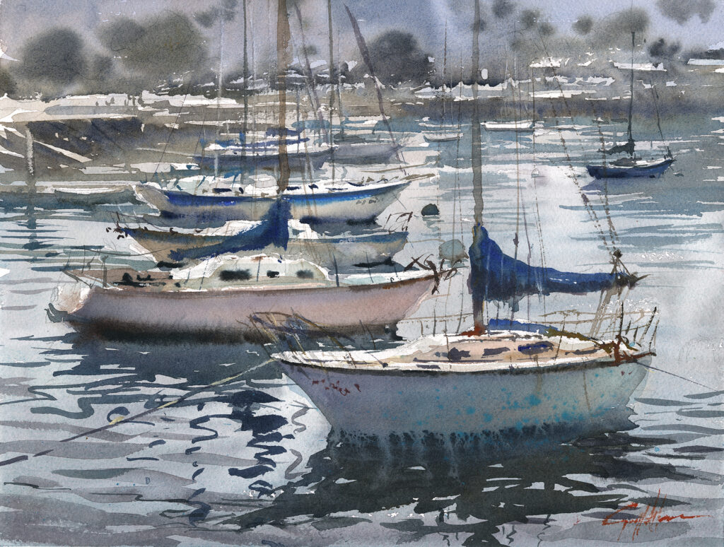
“Color for Nothing” by Geoff Allen
This is a group of boats. I bet there were probably more than this, fifty more or even a hundred more. But the artist picked the ones to group them dynamically together, and so the design is strong and reflects the busy marina. But it is not crowded at all. It gives a freshness. Technically it is how the watercolor should be done. It uses a lot of techniques like splashing the colors or spraying the water but none of the techniques overpower the overall design. So, the design first is strong and very freshly painted as well. People love boats!
Third Place
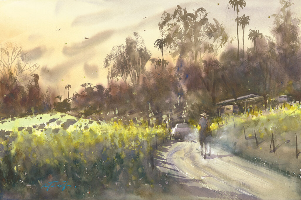
“El Ranchero” by Keiko Tanabe
This is a landscape, landscape. It is a simple one, but again a very strong design. The lights highlight the light on the grass or vineyard. The plants have the darks and the lights strongly as the contrast. But overall, this painting is a soft, soft landscape with a hint of the atmosphere. The person on the horse is painted in there but everything in there is indicated. It is not overly described. Overall, it shows unity and is beautifully done.
Honorable Mentions
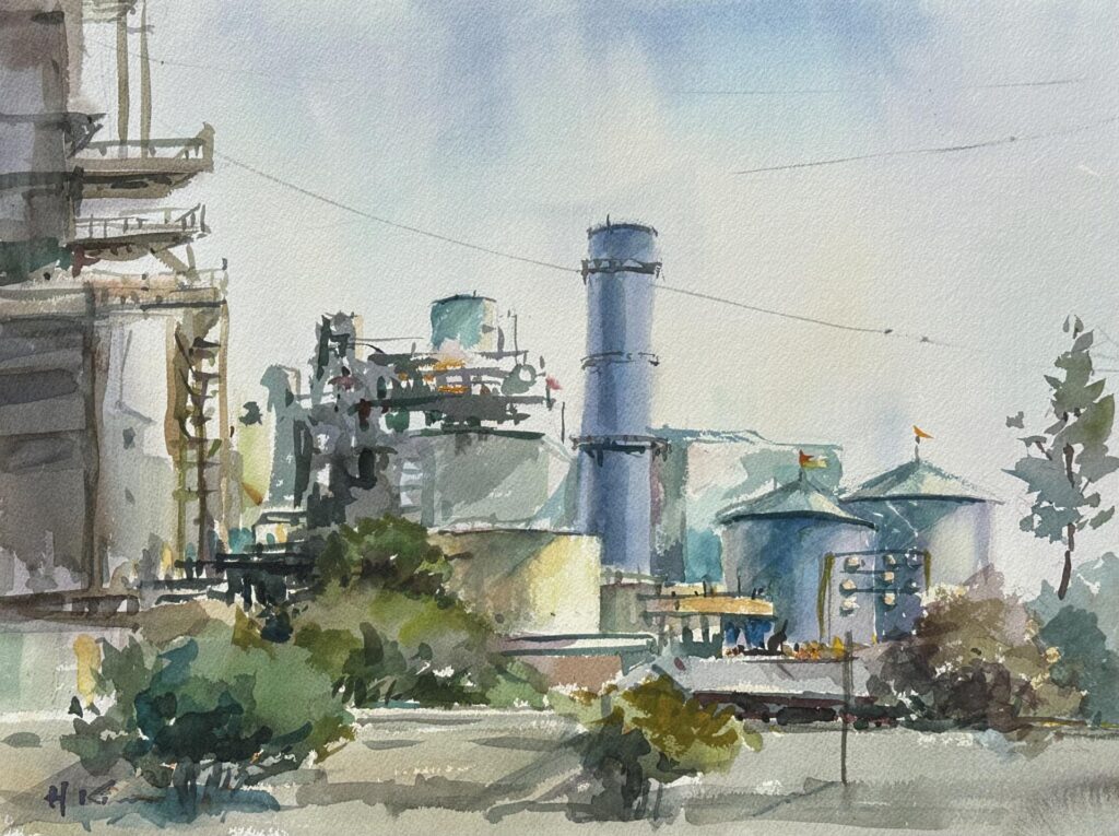
“Power Plant in Huntington Beach” by Hyun Kim
This one is more like an industrial scene. There is a lot of stuff, however this artist freshly painted this one as more of a unified shape. So, you have highs and lows, and the highest is on the left side to hold the painting together. It is very simple. I bet all these industrial things have a lot more going on, on the surface or around it. But simplification makes this overall a unified single larger, darker, shape against the background. That makes it stand out. So, this is why I think it deserves a notification; for artists seeing beauty, from even what, maybe, is not so beautiful, to many other people.
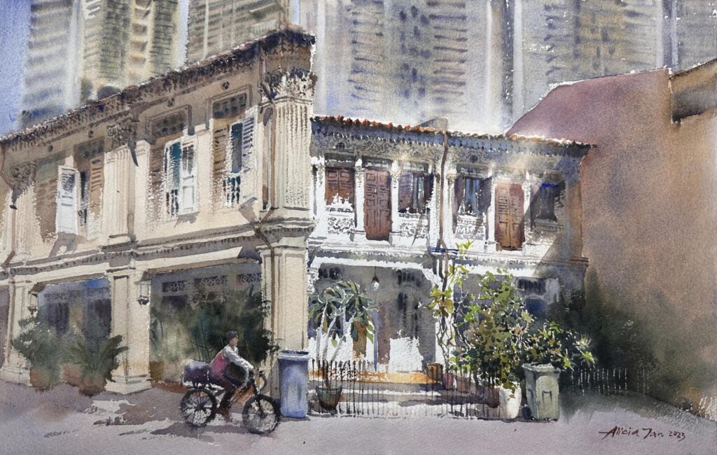
“Foodpanda at Blair Road” by Alicia Tan
This artist has a very good craftsman’s hand. It is very well painted with watercolor techniques. It is well designed. The reason I gave it honorable mention is that I think that sometime, or many times, you really don’t need to paint every detail. It is very well balanced in terms of what is detailed and what is not detailed. Overall, it is still a very strong painting. I felt a little bit that the artists can be more forgiving for what is in the reality.
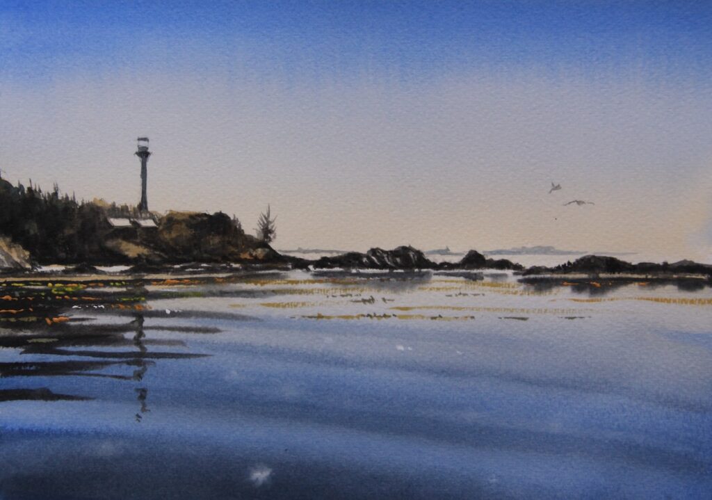
“Torfino on Vancouver Island on a Warm Day” by Jan Min
In a seascape or waterscape, what I like is the simplicity of the design and how a simple technique is used for the water and for the sky. There is no nonsense or no overpainting. It does not have unnecessary details. It is well painted, as freshly as possible, in the plein air situation.
