Juror Alice Kayuha
‘
Juror Commendations
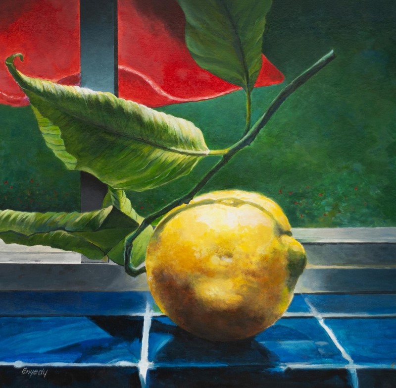
“Summer Lemon” by Anthony Enyedy
The use of true pigment colors in here rather than using mixed colors demands the viewer’s attention. The lighting on the lemon itself spotlights it so your eye is drawn to it right away. This is not an unusual composition, but it has the blend of colors that puts a real punch to the painting.
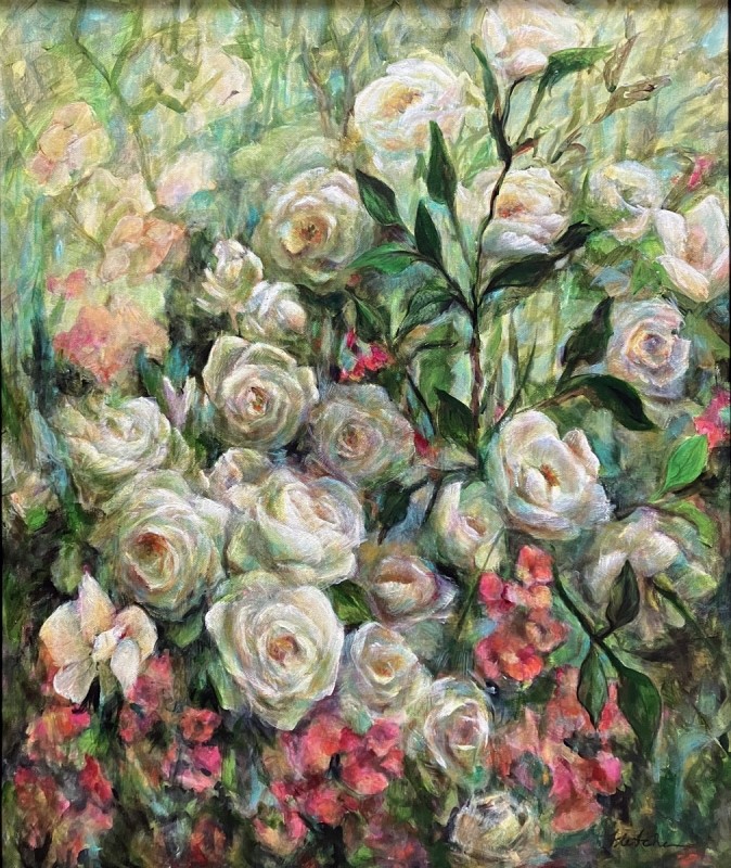
“Abundant Summer” by Jane Fletcher
Although this subject matter is not unusual, the composition makes it interesting. The technique that was put into it, and its organization along with the the highlights on each of the roses and their individual petals add a new element. You’d never get tired of this painting if it hung in your home.
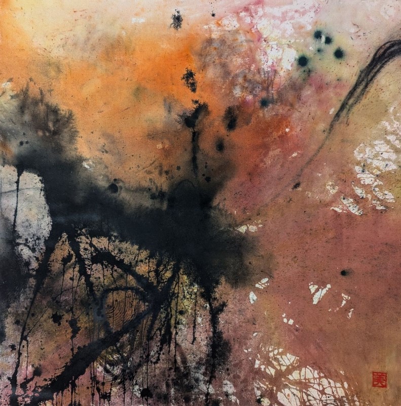
“Bonfire” by Michiyo Matsuura
This painting, primarily in neutrals, still caught my attention. It stands out and has a lot of appeal in spite of not illustrating an objective subject. It demonstrates that a painting need not illustrate anything to be attractive and beautiful. I was pulled into it right away.
Honorable Mentions
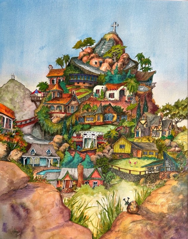
“Double Helix” by Tim Coleman
This has a wonderful composition, with an almost fairy tale structure. It makes me think of the “Wednesday’s Palace” piece at the Mingei Museum. It has all those little paths and houses that you can look at for a very long time and continue to see something different. It won’t wear you out.
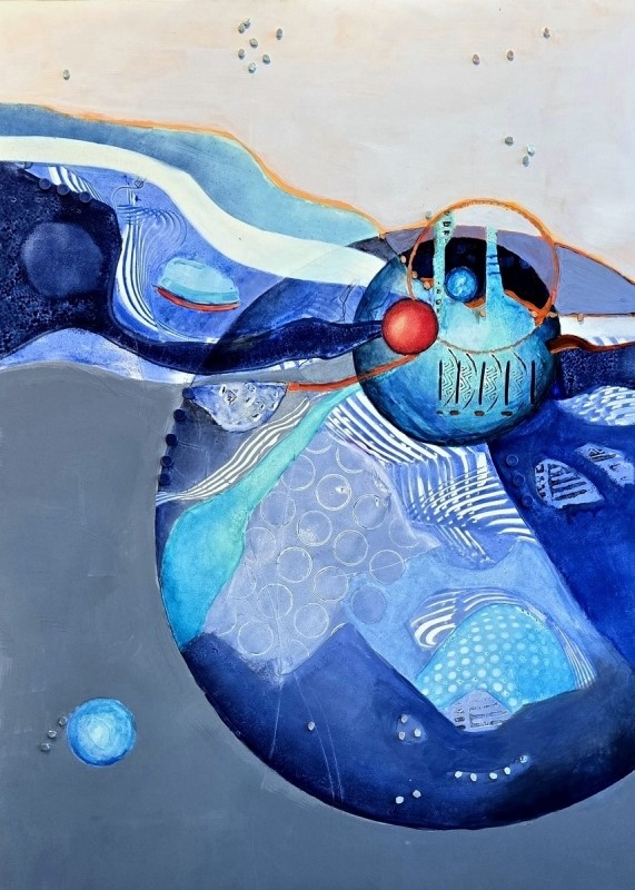
“Red Ball” by Wanda Honeycutt
This painting really jumped out at me. The blending of those colors and the wonderful shapes broadcast, “Look at me!” The white band guides your eye to the centerpiece of the one touch of red in the ball. The variety of shapes, and the colors hold your interest. It is well put together.
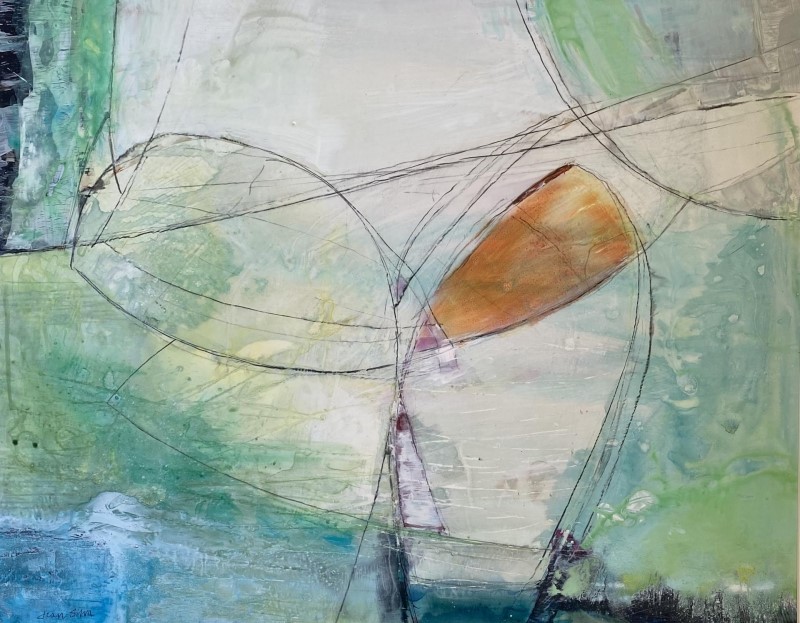
“Intersecting” by Jean Silva
The very fine lines through the color really drew my attention. The lines lead your eye through the whole composition. It is reminiscent of butterfly wings, but it could be anything. I could look at this painting for a long time before I would get tired of it.
Honorable Mention Miniatures
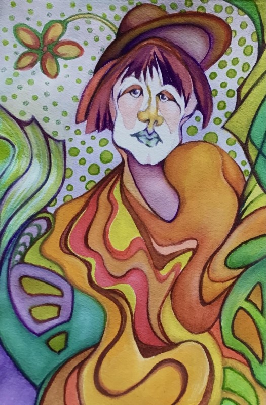
“Flower Child” by Ann Slater
I love the expression on the character’s face! The selection of colors is wonderful, and the background is simple yet distinct. It really brings the character forward. She has a lot of attitude, and her expression and tilt of her head scream “Hey you! Take a look!”
Best of Miniatures
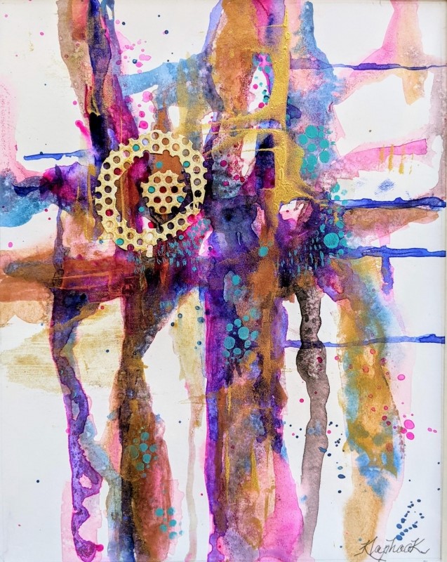
“Fundamentally Fun” by Nancy-Jo Klaphaak
I loved the colors selection in this piece. They are an unusual but pleasant mix of colors. The cruciform -composition adds a great base with a variety of shapes within it. Taken together, the color, composition, and shapes make it a winning painting.
Best of Theme
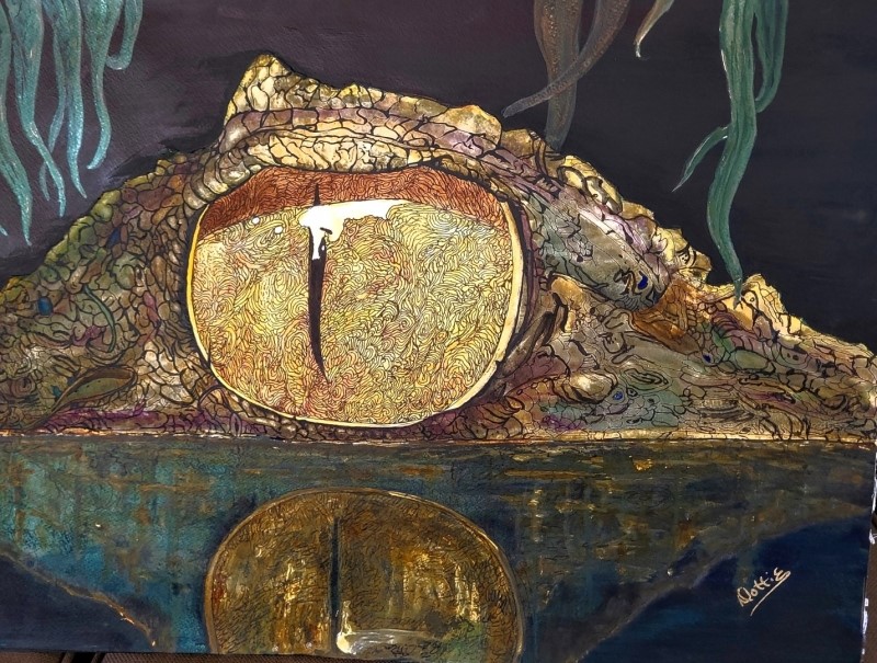
“Got My Eye On You” by Dottie Thompson
This painting fits the Best of Theme because it really is mysterious. When you first look at it, you don’t even realize what it is. Then you see that it is an eye, probably of a crocodile or alligator. The reflection really begins to take on the presence of an eye looking at you. So, it really has a mystery to it.
Third Place
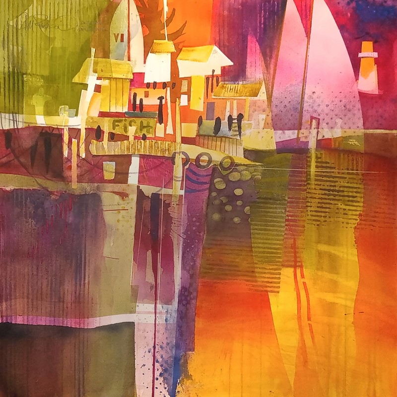
“Evoking Mystery” by Chuck McPherson
In this one, I am drawn to the colors. It seems an unusual complement, yet an appealing selection of colors. Its cruciform composition enhances the presentation. The subject of boats and the boathouse is a charming focus. The colors and shapes in it, are uniquely individual to this work.
Second Place
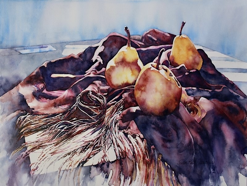
“Velvet Tapestry, Tassels, and Fringe” by Susan Keith
It’s the unique selection of colors that attracts this viewer. The contrast of the dark areas with the surrounding light areas frame the presentation. The highlights on the pears capture your attention. They are sitting on the tapestry adorned by nothing but light. A pleasant scene.
First Place
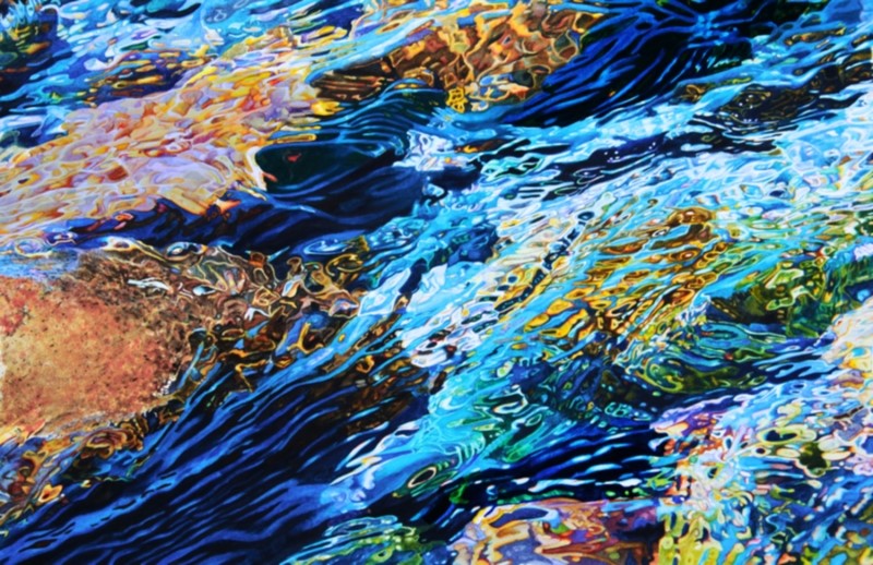
“Water and Rocks” by Robin Erickson
My first impression was of an abstract painting. But I was quickly influenced by the strong sense of motion, with colors and shadows. This rendition of a moving water source glows. You want to keep looking at it, as the motion and the transparency are so distinctive.
