“Finding Nuance”
Juror Krentz Johnson
.
Juror Commendations
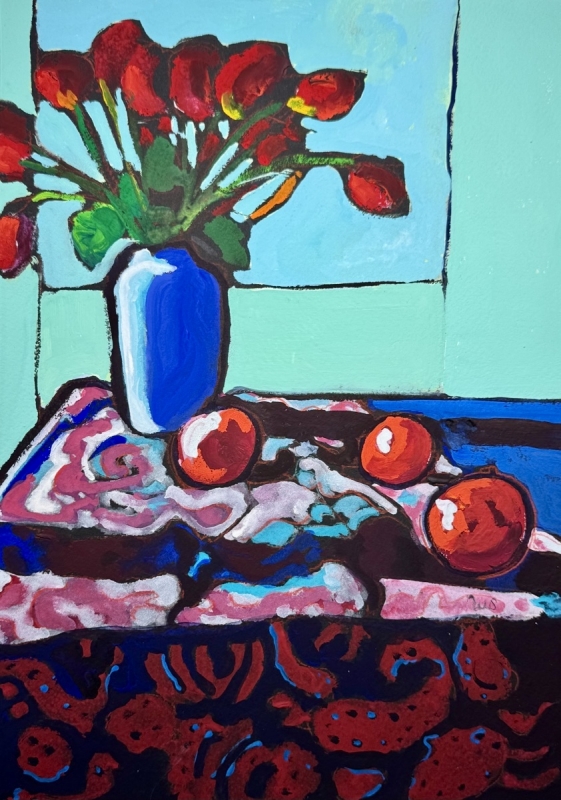
“Blue Vase on a Table” by Sarah Sullivan
I really enjoy the color work in this painting. There are some very pretty, lighter colors of the greens that contrast with the brilliant placement of the reds. It is a very traditional subject matter of a still life, but the way color and value are used, along with the unique colors, it creates an overall effect that is distinctive. The artist has kept the shapes simple, there is an almost calligraphic use of the lines, and she has created movement in the dark shapes, so it kept my eye going. It’s hard for me to walk away from it. It has a lot of fun and interesting color choices that make it arresting.
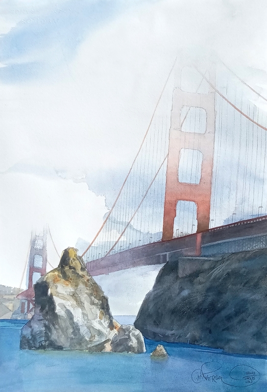
“Foggy’s Notion by Chuck McPherson
The painting introduces almost an iconic theme. This interpretation of the Golden Gate Bridge is quite unique. I’m not sure what drew me in to it. Possibly it is the technique. One could say that it is an over-done theme, but this artist totally refreshed it. He has added such nice cloud shapes; and, of course, technically everything works. It’s almost playful how he made the angle of the towers, which are not rigid in any way, and added the detail of the cables. There is a lot of reality in the painting, but the artist also plays with an interpretation that is very exciting to me.
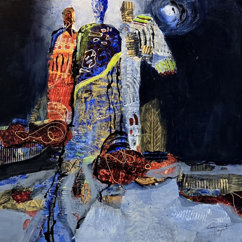
“Connecting to Grace” by Wanda Honeycutt
The colors in here are truly exciting. There is just enough abstraction to play with a variety of ideas. You can see figures or totems and imagine a night scene. There are a lot of very creative uses of line. The plain fields of color are broken up with textures. Color wise, there are really strong colors, but nothing dominates, and it all works together. I think it is really bold.
Honorable Mentions
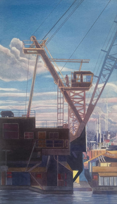
“Commerce 3” by Michael Garberick
This painting displays a flawless technique, and some very challenging color usage. It is drawn so well. The drawing areas associated with all the industrial equipment allows us to see some things in great detail, and in other areas there are shapes just suggested with line. The painting has a great composition, and nice color; colors that you might not see in an industrial area. It seems in some areas like they were added just for the sake of the shapes, such as the one color in the center, which shows nice blending with a fine wash. That color is carried to the edge on the right. There is a dark area on the lower left that still has detail in it, making a nice contrast with the rest of the painting.
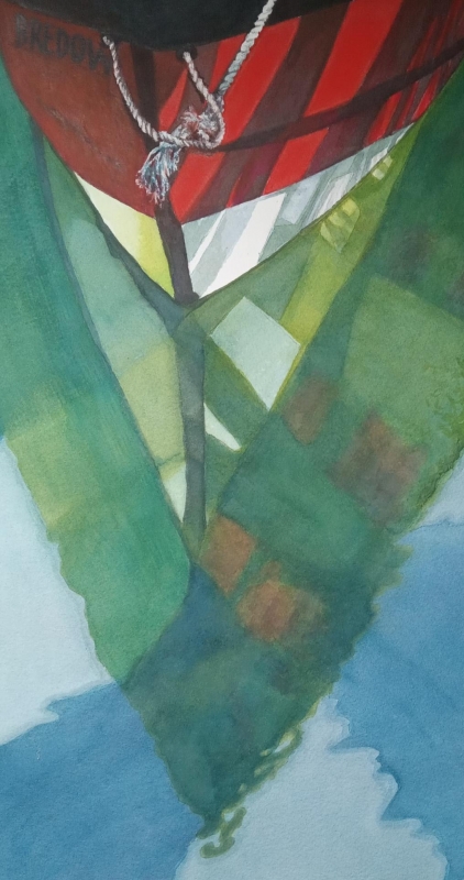
“Reflection” by Lynette Bredow
This is a challenging subject matter, and the colors just wowed me. The artist has an amazing eye for how water can do some crazy things to develop an abstract look. The interpretation of the colors in the water has some exceptionally nice washes: greenish yellow with the white paint on the left, and the green with the yellow going into the other side of the boat. I like the shadows punching into the red. There is a sweep of a large shadow suggesting trees that bites into this technically amazing composition. There are a lot of little surprises, and it touches on realism with the detail on the rope confirming that this is a boat scene.
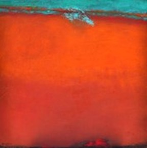
“Red Desert With Green Sky” by Peggy Hinaekian
This abstract has very nice colors: the complementary pair of orange with the bluish green. It has a color field feeling, so the size of the painting, with the large panel format, really works. There are clean areas, and an orange band with a green band; but, as you look further in, you see nice variations that catch the eye. The cool and hot spots suggest one color fighting with the other, creating a sense of drama. The composition is good, especially where the strong colors are muted with dabs of the opposite color.
Honorable Mention Miniatures
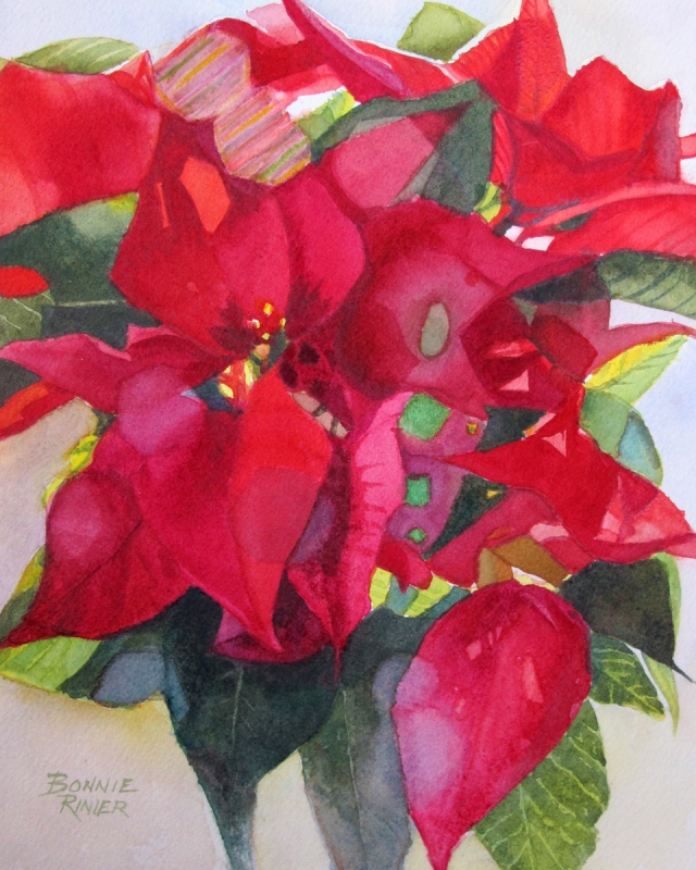
“Poinsettia” by Bonnie Rinier
This one stands out because two complementary colors are truly excellent. The overall technique is very good. It is abstracted a little, but you know they are poinsettias, and there is some play in the abstraction which is fun. It was a nice surprise to see it.
Best of Miniatures
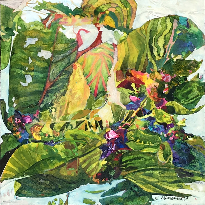
“Tropical Garden” by Carol Mansfield
The painting shows a unique technical application of the medium. The color choices – greens and reds – are really exciting. Some muted areas are present to let the eye rest, and then the viewer is drawn into the painting with texture. I really enjoy that the techniques and color choices are so good, and the playful elements within the painting are fun surprises.
Best of Theme
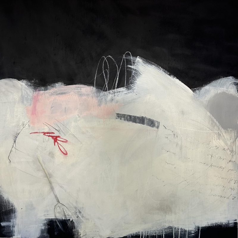
“Essence of Less” by Michele Joyce
This is a very nice abstract painting. It works with the theme of “Finding Nuance” in that when you first see the black and white areas, you almost say, “that’s nice” and move on. But then the other items catch the eye. There’s handwriting and calligraphy, some nice neutrals, some punches of color here and there, nothing splashy or crazy, everything working together for enjoyment of this basically monochromatic work.
Third Place
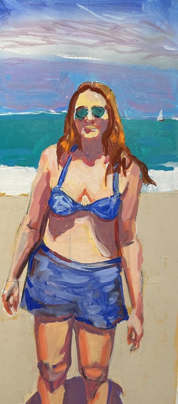
“Eternally Emma” by Richard Glassman
This painting is very exciting. For starters, there is the wonderful brushwork, and the bold colors. There are surprise colors in there too, but also a nice mixture of resting neutrals, and then the complementary oranges next to blues. The subject is a portrait which is very good, and it evokes the person’s personality. There is a lot going on with the free brushstrokes and the nice colors capturing the emotion of the person. The fact that there are such bold colors in surprising places also emphasizes the portrait, and I think it is a really gutsy painting.
Second Place
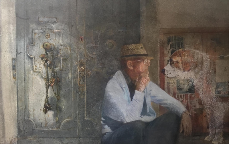
“WOOF” by Edward Abrams
This one has all the technical perfections. In the interesting composition, the eye goes right to the dog and to the wonderful portrait of the man. Then, with the ornate doorway, the composition is driven across the middle. The reason why this painting stands out from the other highly technical paintings is that there is a real emotional bond shown that is so amazing. I almost cried when I saw it. There is an excellent mood of mystery that the artist communicates so well.
First Place
“Let All Creation Rejoice” by Susan Keith
The size of the painting is already very challenging; having done that is a feat in itself. The color is very good; the complementary colors are just so exciting. There is an intense realism in it, but there are also a lot of places that are kept a little bit abstract. These places provide a break from the enjoyment of the highly realistic sections. Overall, the technique is very good. It has a nice variety that holds my interest.
