Juror: Kathleen Scoggin
.
Juror Commendations
“Before the Storm” by Perry Fowler
This is a lovely little painting. There are a lot of areas where I live that are rocky, so it really speaks to me. It has a great sense of place. The artist managed to get the greens down into the foreground, into the rocks, so that carries the colors through the painting. It makes me want to walk back through that canyon and see what’s back there. For a smaller painting, it speaks very well from a distance.
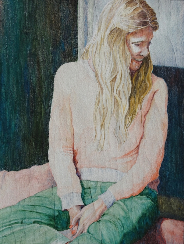
“Remembering” by Julie Anderson
This is a lovely figure. What makes the painting strong is the total division of space, the whole painting fits. The shapes in the background are so solid and so varied in value, although you don’t see a lot of color change, there is green that echoes other parts of the painting. The neutrals do a lot to offset the figure. The strong background holds the painting together very well. It is beautifully executed.
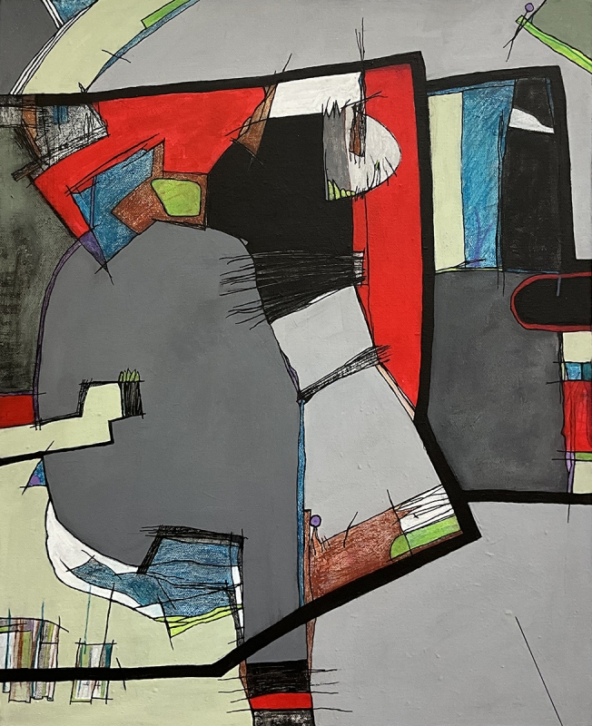
“Midcentury Update” by Melodie Tune
This abstract jumped out at me. It is a beautiful collection of shapes of all different sizes. They are all linked together, so the painting all becomes one piece. It has an excellent division of space, there quiet areas but enough activity going on with a lot of texture in small parts of the painting. The red against the grays, the neutralized greens – all this really makes the painting pop. It is very lively fun abstract.
Honorable Mentions
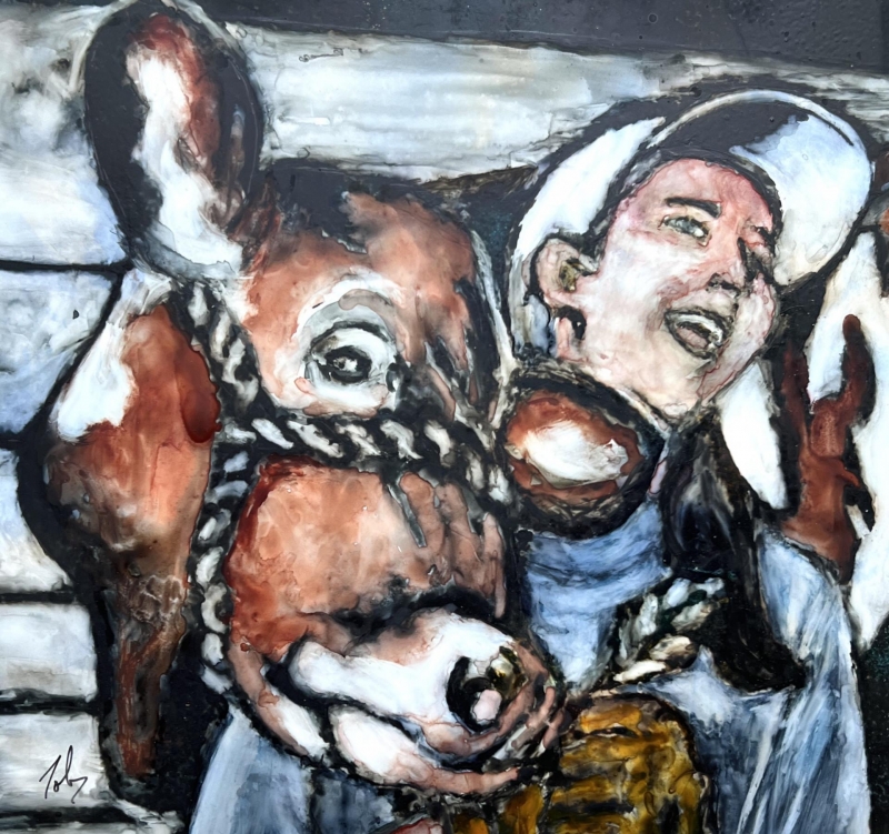
“Brown Beauty on Yupo” by Toby Scriba
This painting just makes me happy. You can tell the man is happy and the cow looks pretty happy too. It tells a story about the man and his animal – they are interacting in some way. It caught my attention with the dark edges around the figures, which is an interesting way of painting. The color palette is very nice. It’s very stylized and abstract in a way. The shapes are perfect.
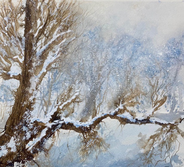
“Last Snow” by Mary O’Boyle
This little painting made feel good the first time I looked at it. It feels like walking through the snow. There is a wonderful design to the painting, and a beautiful treatment of the limbs of the trees. Then it fades into the distance of the wilderness and the snowstorm. It has a lovely color palette, subtle colors that really work.
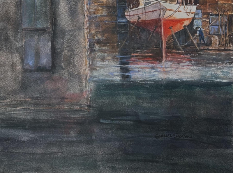
“Stored for the Winter” by Gabriel Stockton”
This painting is very unusual. Its beautiful design jumped right out at me. The red and the white hold it together, and they are in an interesting place, and that’s what makes it so delightful and intriguing. It takes you back into the layers of the painting. Its overall composition is very nice.
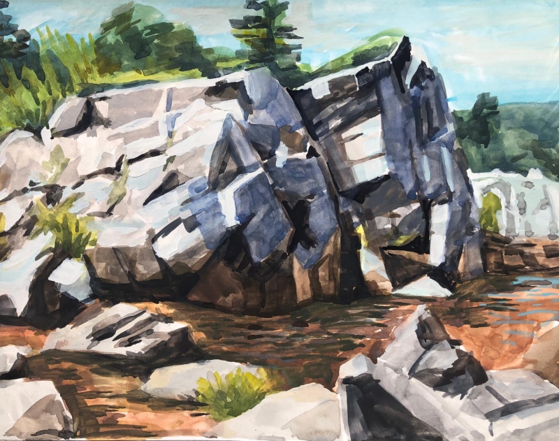
Honorable Mention, Miniatures
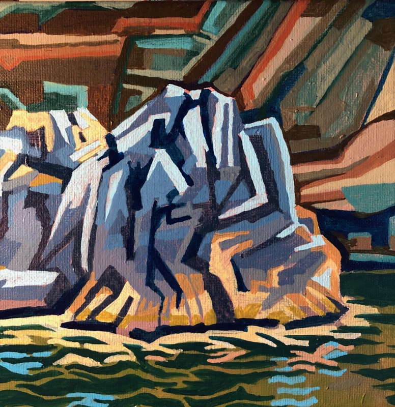
“Rhythm Rock” by Perry Fowler
This is a very interesting, dynamic, and unusual painting. I was attracted to it immediately because of the graphic nature and the style. I like the effect that it gives you of the rocks and the water, all done in smaller shapes put together to make larger shapes. The use of color spread throughout the painting is very good. There is a good feeling of dimension yet painted in a flat manner. Its uniqueness makes it very strong.
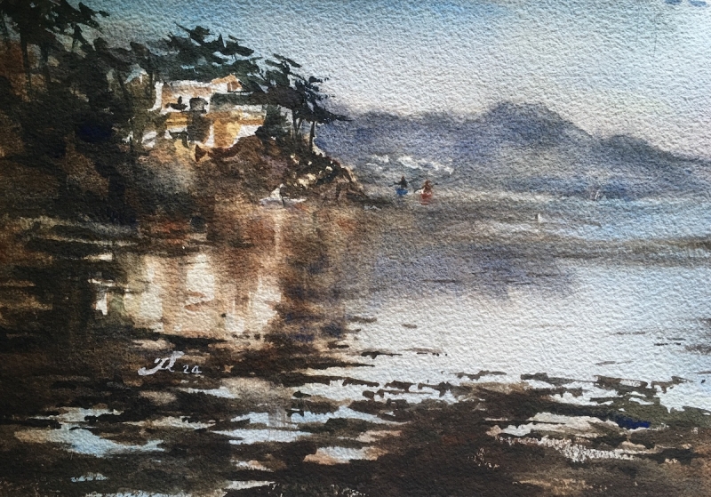
Best of Miniatures
“Morro Bay” by Fan Li
This a beautiful, classic watercolor. The division of space is fabulous. The use of hard and soft edges throughout the painting gives you lots of variety and interest. The color palette shows the power of value, and it has been used very well. The reflection of the house on the water, as well as the other reflections are beautiful. It’s just a lovely little painting and it makes you want to be there.
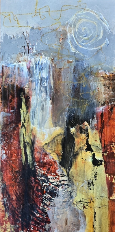
Best of Theme
“Canyon Dreams” by Wanda Honeycutt
This is an abstracted landscape, which appeals to me personally. I selected it for the theme because of the gold, since the meaning of alchemy is changing other metals into gold. It also means more generally a transformation or a change. I see a lot of that in this painting. I love the abstractedness in it. Also unusual is the overall shape of the painting that fits the subject matter so well.
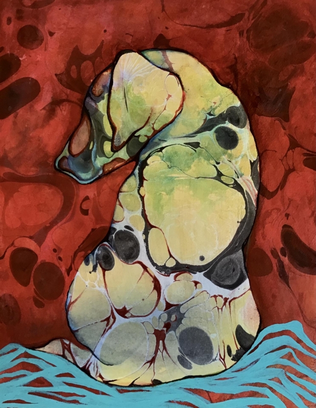
Third Place
“Backward Dog” by Ann Slater
The first time I was attracted to this painting, I didn’t realize that it was a dog. I liked the abstract shapes. It’s a lovely painting. The shapes within shapes make it extremely interesting, and so different from the other pet portraits that are in the show. The red brought into the turquoise at the bottom shows a great sense of color and the whole painting works together. The painting draws you in and holds you there for awhile.
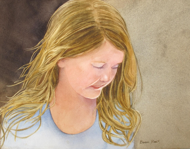
Second Place
“Contemplation” by Bonnie Rinier
This painting jumped at me from the beginning. The division of space into the large shapes, and the muted color palette are so well done. You get a sense of feeling her attention to what she is looking at, and of wondering what she is thinking about. I particularly like the overall design and the color palette.
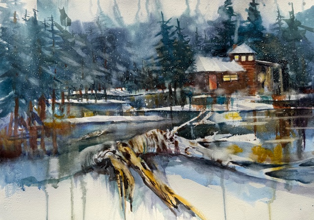
First Place
“Driftwood Winter” by Lorri Lynch
This is an absolutely beautiful painting. It reminded me of the theme, as the bit of gold moving throughout the painting fits with the alchemy theme of the show. The division of space is lovely, the darks and lights are appropriately developed. It gives a strong sense of place. You feel the cold, the warmth of being inside the building that is nestled down in the trees. The beautiful oblique shapes of the logs in the foreground, directing the eye back to the house, and the warm glow coming from the house make it a lovely painting.